You did everything right. You gathered the paint swatches, picked a bold, beautiful color, taped off the edges with surgical precision, and spent a weekend transforming one wall of your room. You step back to admire your work, and... something is just not right. Instead of a chic, intentional focal point, the wall feels awkward, jarring, or simply out of place.
If this sounds familiar, you're not alone. The accent wall is a classic design tool, but it's deceptively tricky to get right. It's rarely about the color itself and almost always about the context. From choosing the wrong canvas to creating a color that fights with its surroundings, there are a few common missteps that can derail the entire effect.
Think of this as your diagnostic guide. We'll walk through the most common reasons an accent wall falls flat and, more importantly, give you clear, actionable ways to fix it—often without having to pick up a paintbrush all over again.
You've Highlighted the Wrong Wall
This is by far the most common issue. We often think of an accent wall as a way to add a pop of color to a boring room, but that’s not its primary job. A successful accent wall doesn't create a focal point from scratch; it enhances a focal point that already exists.
The True Purpose of an Accent Wall
An accent wall should draw your eye to the most important feature or function of the room. It provides a visual anchor and helps organize the space. When you accent a random, empty wall, you're essentially shouting, "Look at this blank wall!" This confuses the eye and can make the entire room feel unbalanced and chaotic.
How to Spot the Right Wall
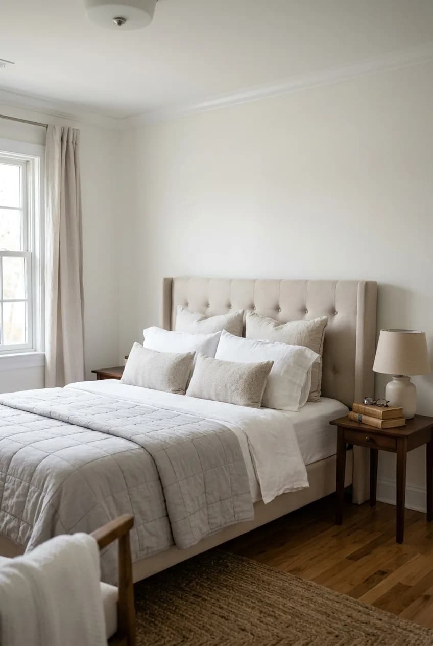
Walk into your room and notice where your gaze naturally lands. What is the room's main purpose? The best wall is usually the one that supports that purpose. Here’s a quick guide:
- In a bedroom: The wall behind the headboard is almost always the correct choice. It frames the bed and solidifies it as the room's centerpiece.
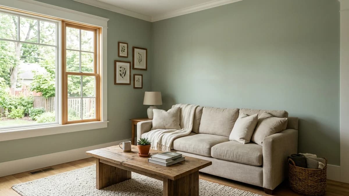
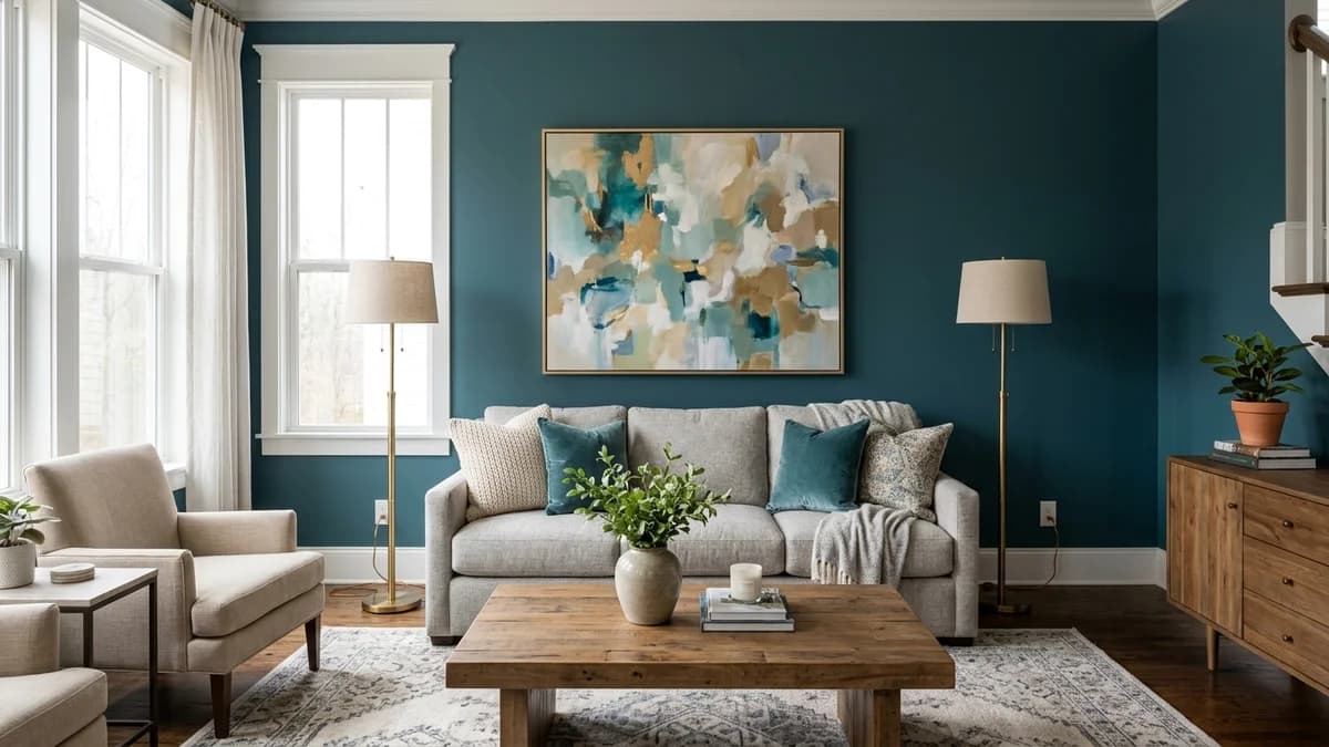
- In a living room: It's typically the wall behind your main sofa or the wall that houses the fireplace and mantel. Both are natural gathering and focal points.
- In a dining room: The wall behind a sideboard or buffet, or a solid wall that can serve as a backdrop for a stunning piece of art.
- In an office: The wall behind your desk, which helps define your workspace.
Here's the key insight: The best accent wall isn't necessarily the first one you see upon entering a room, but the one that grounds the room's main function. It should feel inevitable, not arbitrary.
Common Mistakes to Avoid
More in Home Decor
A Beginner's Guide to Understanding Paint Undertones
Avoid choosing walls that are chopped up with too many doors, windows, or other architectural breaks. These interruptions fight with the color and make the accent feel disjointed. A solid, continuous surface makes the most powerful and cohesive statement.
Your Color Choice is Creating Conflict
You found a paint chip you loved under the fluorescent lights of the hardware store, but now that it's on the wall, it feels... wrong. A color chosen in isolation is a recipe for disaster. It has to live in harmony with everything else in the room, from the big things like the sofa to the subtle tones in your wood flooring.
One of the sneakiest culprits is undertones. Your beige carpet might have a pinkish undertone that clashes horribly with a new green accent wall that has a yellow undertone. The non-obvious trick here is that a successful accent color doesn't just match your decor; it pulls a specific, often subtle, undertone from your existing neutral palette and amplifies it. If your gray sofa has a hint of blue in certain light, a navy accent wall will make the whole room feel incredibly cohesive.
Beyond undertones, consider the mood. Color psychology is real, and a high-saturation color creates a high-energy feeling. That might be great for a creative office, but a fire-engine red in a bedroom can feel agitating rather than restful.
Color Family | Typical Mood | Works Well For... |
|---|---|---|
Deep Blues & Greens | Calm, stable, sophisticated | Bedrooms, offices, living rooms |
Warm Terracottas & Oranges | Cozy, energetic, welcoming | Dining rooms, entryways, family rooms |
Rich Purples & Burgundies | Dramatic, luxurious, creative | Dining rooms, reading nooks, powder rooms |
Charcoal Grays & Blacks | Modern, grounding, dramatic | Living rooms, media rooms, bedrooms |
Finally, consider the finish and how you'll integrate the color. A high-gloss or even satin finish will highlight every tiny bump and imperfection on your wall and can create an unpleasant glare. An eggshell or matte finish is almost always a safer bet. To make the color feel truly intentional, repeat it in at least two other small spots around the room—a throw pillow, a pattern in the rug, a vase on a shelf. This repetition tells your brain that the color belongs there.
The Wall Feels Disconnected from the Furniture
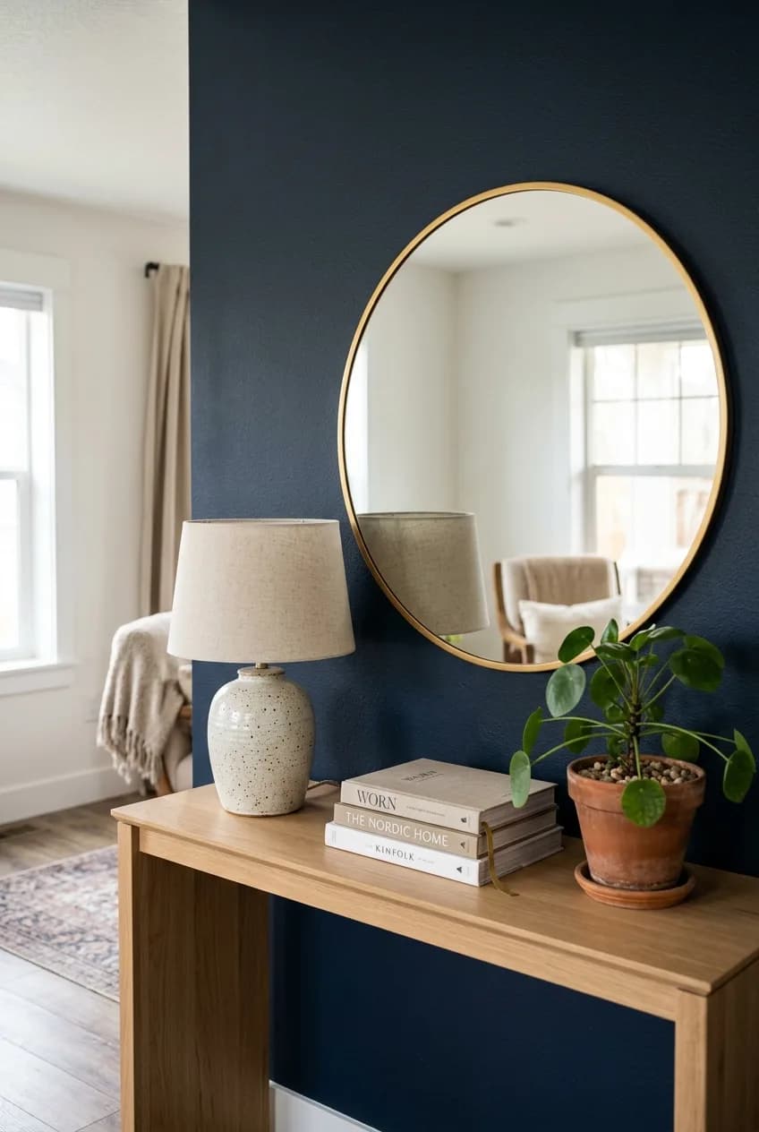
Have you ever seen an accent wall that just seems to be floating in space? It's a block of color with nothing against it, completely disconnected from the rest of the room. This 'floating wall' phenomenon happens when the accent wall isn't properly anchored by a significant piece of furniture.
An accent wall should serve as a backdrop for a 'vignette'—a curated little scene. The easiest way to achieve this is to place your most important piece of furniture on that wall. Your sofa, your headboard, a long console table, or a dining room sideboard should be physically up against it or just a few inches away. This immediately grounds the color and gives it purpose.
If you can't place a large piece of furniture there, you can still bridge the gap. A large-scale piece of art or a substantial mirror can serve as the anchor. Then, use lighting to complete the connection. A floor lamp in the corner or a pair of sconces flanking the artwork will draw the wall into the room's overall design scheme.
Here’s a simple rule to follow: think of your accent wall and its primary piece of furniture as a single unit. If you can't visually connect them with furniture, art, or lighting, the effect will always fall flat.
The Pattern or Texture is Overwhelming the Space
Accent walls aren't just about paint anymore. Wallpaper, murals, shiplap, and board and batten can create incredible depth and personality. But with great pattern comes great responsibility. When a textured or patterned wall goes wrong, it can make a room feel smaller, darker, and oppressively busy.
Getting the Scale Right
Scale is the number one consideration. A large, bold, and dramatic wallpaper pattern can look stunning in a large room with high ceilings, but it will absolutely swallow a small powder room, making it feel claustrophobic. Conversely, a tiny, intricate pattern (often called 'ditsy') can look like visual noise from across a large living room, just appearing messy and undefined.
The insider tip is to ensure the scale of your wallpaper pattern has a direct relationship with the scale of your furniture. A large-repeat floral pattern demands a visually weighty sofa or a substantial dining table to balance it. If you pair it with delicate, leggy furniture, the wall will completely dominate the room, making your furniture look like dollhouse props.
Consider Your Viewing Distance
How far away will you be from the wall? A complex wall mural needs space to be properly seen and appreciated. If it's in a narrow hallway where you're always standing two feet away from it, you'll never see the full picture and it will just feel chaotic. Similarly, a heavy texture like reclaimed wood or 3D panels needs to be balanced. If your accent wall has a lot of visual weight and texture, the other elements in the room—like textiles and furniture—should be smoother and simpler to give the eye a place to rest.
How to Fix Your Accent Wall (Without Starting Over)
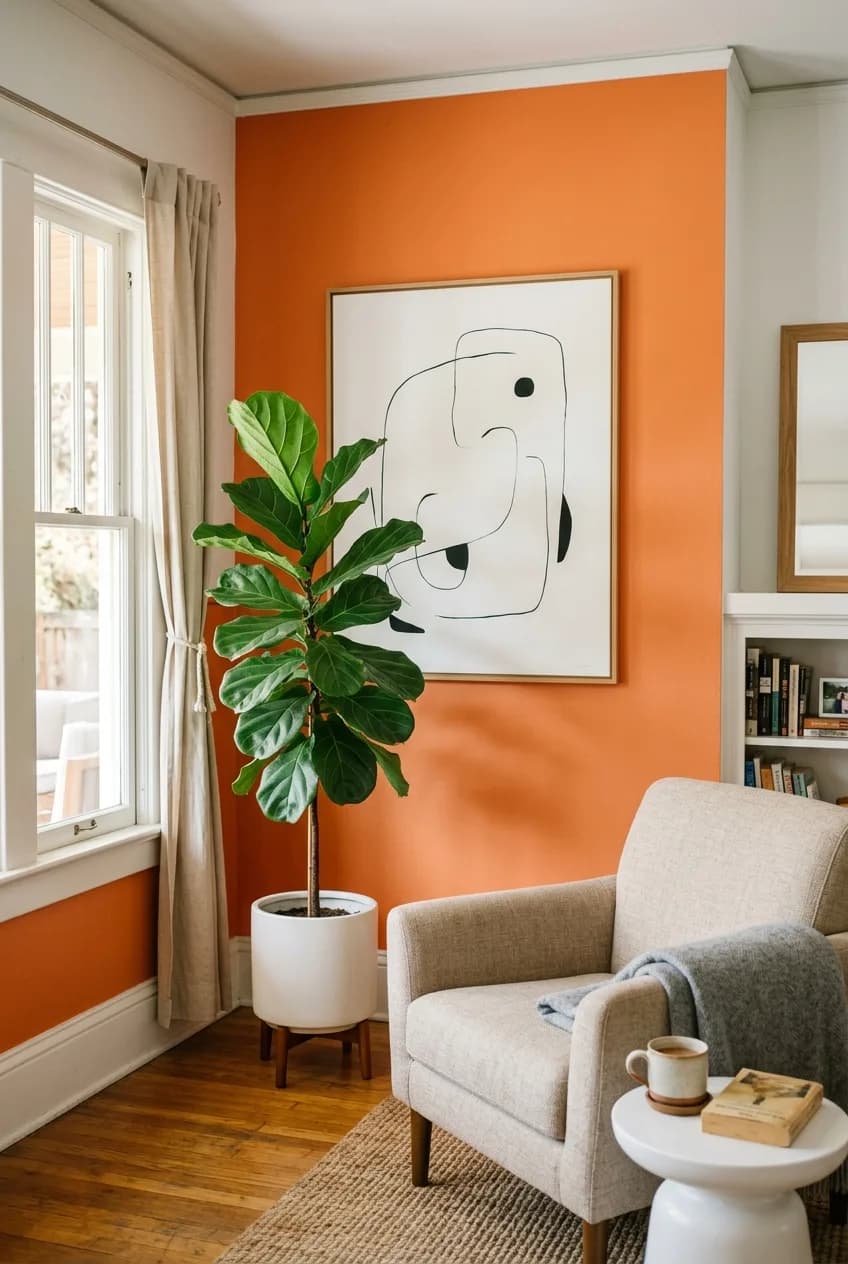
So, your accent wall isn't quite right. Don't panic and reach for the primer just yet. Before you commit to a total do-over, there are several designer-approved tricks you can use to tame a problematic wall and bring it back into balance.
Often, the problem isn't the color itself, but its sheer, uninterrupted surface area. The fastest fix is almost always to strategically break up that block of color with decor, rather than repainting. Think of it as accessorizing your wall.
- Break it up with Art: If the color is too bold or intense, hang a very large, neutral piece of art over it. A piece with a lot of white space or a simple black-and-white photograph can tone down the background color significantly.
- Use a Mirror: A large mirror not only breaks up the color but also bounces light around the room, which can counteract an accent wall that's making the space feel too dark.
- Cover a Portion with Furniture: Don't underestimate the power of a tall piece of furniture. A tall, open-backed bookcase (an etagere) or a high-backed cabinet placed against the wall can reduce the color's impact by 30-50% while adding functional storage.
- Soften with Lighting: The right light can completely change a paint color's appearance. Try placing a floor lamp in the corner that washes warm light up the wall. This can soften a harsh color and add a lovely ambiance in the evening.
- Consider a Modern Alternative: If you're ready for a change, look at a concept called 'color drenching.' Instead of just one wall, you paint the accent wall plus its trim, baseboards, and even the door the same color. It's a sophisticated, modern look. Or, paint the wall back to neutral and create a focal point with a large, well-organized gallery wall of art instead.