Have you ever picked a beautiful shade of gray at the hardware store, only to paint your walls and find yourself living in a light purple room? Or maybe you chose a soft, gentle beige that now looks strangely pink in the afternoon light. It’s a frustratingly common problem, and it’s almost always caused by one thing: paint undertones.
Think of undertones as the hidden personality of a paint color. Getting them right is the secret to creating a room that feels cohesive, intentional, and beautiful. This guide will help you decode those subtle hints of color so you can choose the perfect shade with confidence, saving you the headache and cost of a repaint.
What Exactly Are Paint Undertones?
Every paint color has two parts: the main color, or mass tone, and the undertone. The mass tone is the color you immediately see on the paint chip—what you’d call it at first glance, like 'light gray' or 'off-white'.
The undertone is the subtle, secondary color that peeks through. It’s the secret ingredient that gives the color its specific character. Think of it like coffee. The mass tone is 'coffee,' but the undertone could be a hint of cinnamon, hazelnut, or mocha. That subtle hint doesn't turn the coffee into cinnamon, but it absolutely changes the entire flavor and experience. Paint works the same way; a gray with a blue undertone feels completely different than a gray with a green undertone.
Here's the most important thing to remember: The undertone is the color you don't see at first glance in the store, but it's the color that will define the feeling of your room once it's on all four walls. When the color is covering a large surface and bouncing light around, that subtle undertone comes to life and sets the entire mood of the space.
The Three Undertone Families: Warm, Cool, and Neutral
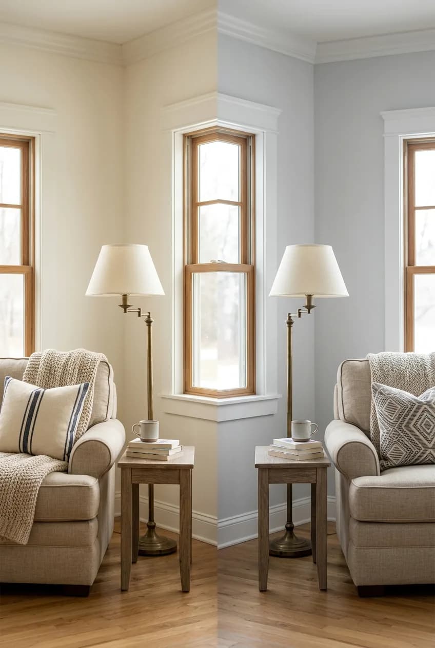
Understanding which family a color belongs to is the first step in predicting how it will behave in your home. Generally, undertones fall into one of three categories.
Warm Undertones
Warm undertones are based in yellow, red, orange, or pink. These colors tend to feel cozy, inviting, and energetic. They can make a large room feel more intimate. When you're looking at beiges, creams, and off-whites, the ones with warm undertones will feel more sunny and traditional. Even a gray can have a warm undertone, which pushes it into the 'greige' or taupe family.
Cool Undertones
More in Home Decor
One Overhead Light? Here's How to Layer Lighting Like a Pro (No Rewiring Needed)
Cool undertones come from blue, green, or purple. These shades create a feeling of calm and serenity, and they can make a small room feel more open and expansive. They often read as more modern and crisp. This is where people often get into trouble with grays—a seemingly neutral gray paint chip can have a strong purple or blue undertone that only appears once it's on the wall, answering that frustrating question, 'Why does my gray paint look purple?'
Neutral & Complex Undertones
Here's a little secret: a 'neutral' paint is rarely ever truly neutral. Colors like gray, beige, greige, and off-white almost always lean one way or the other. The success of using these popular colors depends entirely on identifying which way their undertone leans and pairing it correctly with your space.
For example, a 'greige' is quite literally gray + beige, a mix of a cool and a warm color. Some greiges lean more toward their green or gray undertones, while others feel much warmer. This complexity is why testing is so critical.
Undertone Family | Base Colors | Creates This Feeling | Common Examples |
|---|---|---|---|
Warm | Yellow, Red, Pink, Orange | Cozy, inviting, energetic | Cream, Beige, Taupe, Warm Grays |
Cool | Blue, Green, Purple | Calm, serene, expansive, crisp | Cool Grays, Icy Blues, Sage Green |
Complex / Neutral | A mix (e.g., green-gray, violet-gray) | Varies, depends on the lean | Greige, Off-White, Stone |
Simple Tricks to Identify a Paint's True Undertone
You don't need to be a color theorist to spot undertones. You just need to know how to make them reveal themselves. Here are a few reliable methods.
- The White Paper Test: This is the easiest and fastest trick. Take your paint chip and place it on a piece of plain, bright white printer paper. The stark, pure white background provides a neutral baseline that makes the subtle undertones in your paint chip pop. A beige will suddenly look more pink, or a gray will clearly show its blue or green leanings.
- The Color Family Test: Compare your paint chip to the purest, most primary versions of other colors. Place your gray chip next to a true blue, then a true green, then a true purple. It will 'relax' and look most harmonious when it's next to a color from its own undertone family.
- The Swatch Test: This is the non-negotiable final step. Never, ever commit to a color without testing it in your actual space. Buy a sample pot and paint a large swatch—at least 2 feet by 2 feet—on a white poster board or a piece of drywall. This allows you to move the sample around the room to see how it looks on different walls and in different light without having to paint directly on your current walls, which can distort the new color's appearance.
One common mistake is trusting the paint strip from the store. Paint manufacturers often place colors with clashing undertones next to each other on the same strip to make each individual color stand out. A gray with a green undertone might be right next to one with a purple undertone. This is great for display, but it's very misleading when you're trying to compare similar shades.
Matching Undertones to Your Home's Fixed Elements
The single most important factor for creating a harmonious color scheme is coordinating your paint with the fixed elements in your home—the things you aren't going to change. This includes your flooring, kitchen countertops, cabinets, tile, and even large pieces of furniture.
Instead of trying to 'fight' a strong undertone in your flooring or cabinets with an opposing one on the walls, it's almost always better to choose a paint that shares a compatible undertone. This creates a cohesive flow rather than a visual clash.
Working With Warm Wood Tones
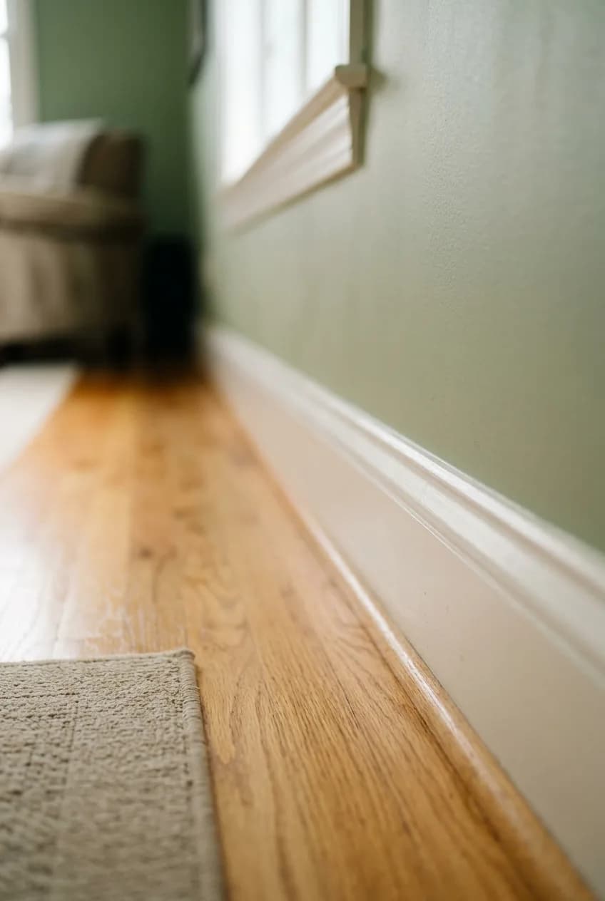
If you have honey oak floors, cherry cabinets, or a yellow-beige carpet, you're dealing with strong warm undertones. Pairing these with a stark, cool gray often looks jarring. The cool gray will make the oak look more yellow or orange, and the oak will make the gray look more blue. Instead, lean into the warmth. A creamy off-white, a soft greige with warm beige undertones, or even a muted sage green will work with the wood, not against it.
Coordinating With Cool Surfaces
For homes with features like Carrara marble countertops (which often have blue-gray veins), black granite, or slate flooring, you have dominant cool tones. These surfaces pair beautifully with crisp, clean colors. A cool gray, a white with a hint of blue, or a soft blue-green will feel intentional and sophisticated. Putting a creamy, yellow-based white next to that cool-toned marble is a classic mistake—it can make the paint look dingy and dated.
How Lighting Dramatically Affects Paint Undertones
Light is the final, crucial factor that determines how a paint color will actually look in your room. Both the natural light from your windows and the artificial light from your bulbs will interact with the paint's undertones, sometimes in surprising ways.
- North-Facing Rooms: These rooms get cool, indirect light all day, which has a blueish cast. This light will amplify any cool undertones in your paint—it's the classic scenario where a soft gray suddenly looks like baby blue on the walls. To counteract this, you might consider a color with more warmth or choose a gray with a known green or beige undertone.
- South-Facing Rooms: Blessed with bright, warm-toned light, these rooms are the most forgiving. The warm light will enhance warm undertones and can soften cool ones. Very light colors can sometimes look washed out, however.
- East-Facing Rooms: Get warm, bright light in the morning that becomes cooler in the afternoon. It's essential to test colors in both morning and evening light.
- West-Facing Rooms: Tend to be darker in the morning and receive very warm, almost orange light in the late afternoon and evening. This intense evening light can really bring out red or yellow undertones.
- Artificial Lighting: The type of lightbulb you use matters tremendously. Older incandescent bulbs cast a warm, yellowish light. Modern LEDs come in a range of temperatures: 'Warm White' (around 2700K) mimics incandescent and enhances warm undertones, while 'Daylight' (5000K-6500K) casts a very cool, blue-toned light that will bring out any blue, green, or purple undertones in your paint.
This is why your testing plan is so simple but absolutely vital. Take your large painted sample boards and observe them throughout the day. Prop one against a wall that gets direct sun and one against a darker wall. Look at them in the morning, in the full afternoon sun, and most importantly, at night with your lamps and overhead lights on. This is the only way to know for sure how you'll love living with the color 24/7.