Choosing a new paint color should be exciting, but it often ends in frustration. You pick a color that looks perfect on that little chip at the store, spend a whole weekend painting, and then… it looks completely wrong. The serene gray you envisioned now looks purple, and the warm beige feels dreary and flat.
It’s a costly and time-consuming mistake, but a completely avoidable one. The secret isn’t in finding the perfect color chip, but in having the right testing process. We're going to walk you through the professional method that guarantees you'll see a color's true character in your home, across every kind of light, before one drop of paint hits your walls.
Why That Tiny Paint Chip Is Lying to You
That two-inch square of paper you bring home from the paint store is a suggestion, not a promise. Several powerful factors can, and will, make the color on your wall look dramatically different.
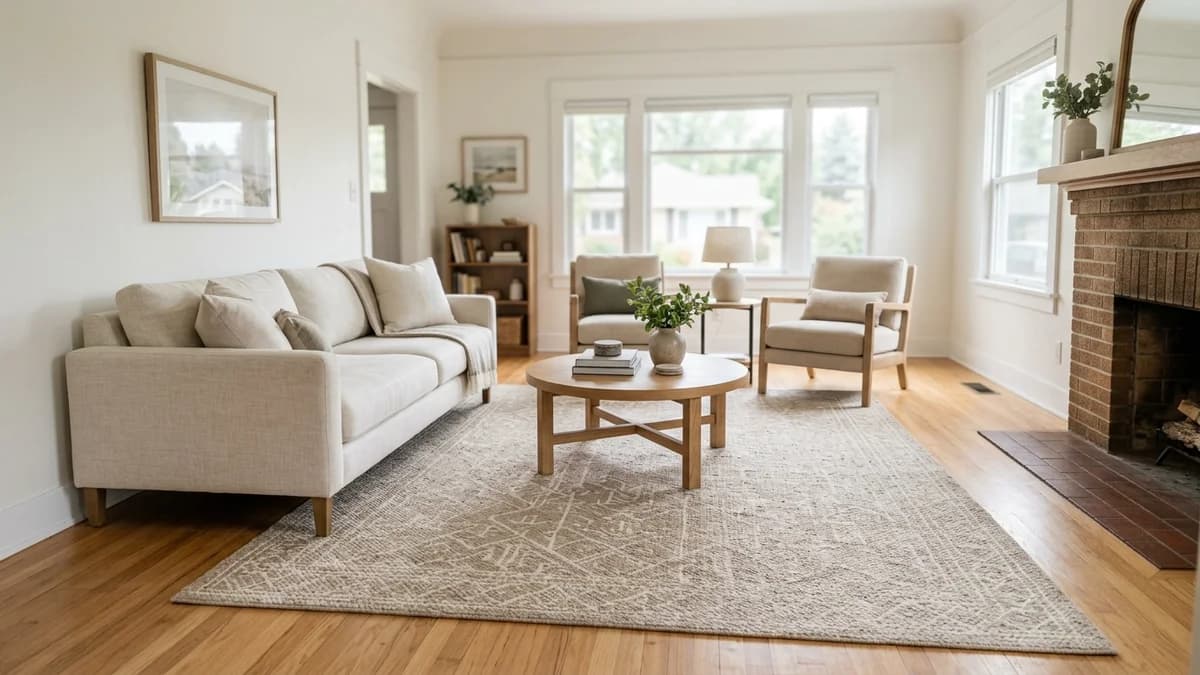
First, there’s a phenomenon called 'metamerism.' It’s a fancy word for a simple concept: a color can look different depending on the light source. The color you see under the bright morning sun streaming through a window will shift in the warm, golden light of the afternoon, and change again at night under your home's artificial lighting. An LED bulb casts a different hue than an old incandescent one, and both are worlds away from the commercial fluorescent lights of the hardware store. In fact, that hardware store lighting is the worst possible environment to judge a color for your home; it's designed for utility and will drastically skew a color's true undertones.
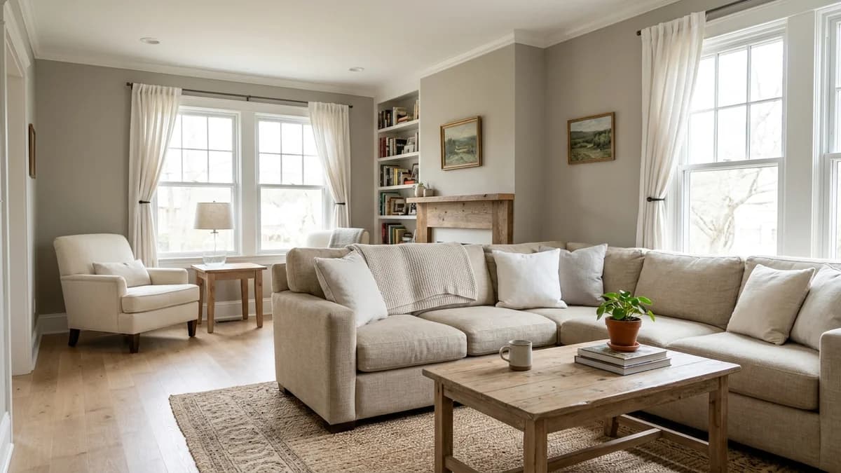
Your current wall color also plays a huge role. Its undertones will reflect onto your new sample, tricking your eye. Even the wall's texture and sheen can alter how a color is perceived—a smooth, eggshell finish will look different than a textured, matte one. And don’t forget everything else in the room! The warm tones in your hardwood floors, the cool blue of your sofa, or even the bright green of the trees outside your window will all bounce color around the room, subtly influencing the final look of your walls.
Your Essential Color-Testing Toolkit
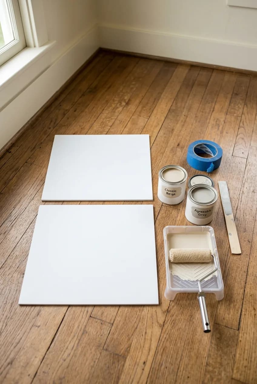
To test colors properly, you need to create a large, movable sample that you can see in different contexts. Ditching the tiny paint chip (and the temptation to paint a splotch directly on your wall) is the first step. Here’s what you’ll need to get it right:
- Sample pots of your top 2-4 color choices
- Large white foam boards or poster boards (at least 12x12 inches)
- A small, 4-inch mini roller with a nap appropriate for your wall texture
- A small paint tray
- Painter's tape
Painting a sample directly on the wall seems easier, but it’s a mistake. The existing color will influence how you perceive the new one, and the difference in sheen between the sample and the old paint can cause a textural imperfection called 'flashing' that might show through the final coat. A separate board is neutral and mobile.
A crucial insider tip: use that mini roller, not a paintbrush. A roller application best replicates the final texture and light-reflecting properties of a fully painted wall. A brush applies paint more thickly and leaves stroke marks, which can give you a false impression of both the color and the sheen.
More in Home Decor
A Beginner's Guide to Understanding Paint Undertones
Sample Type | Pros | Cons |
|---|---|---|
Sample Pots | Most accurate representation of final color and sheen. Allows you to replicate final wall texture with a mini roller. | Requires a small amount of effort (painting the board). Creates leftover paint. |
Peel-and-Stick | Extremely convenient and movable. No mess or dry time. | May not perfectly match the final sheen of the paint you buy. Can be expensive if testing many colors. |
The Two-Coat Method: Creating Large, Movable Swatches
Once you have your supplies, creating accurate test swatches is a straightforward process. Following these steps ensures your sample is a true preview of the finished result.
Step 1: Prep and Paint
Lay down some newspaper and get your boards ready. Pour a small amount of your sample paint into the tray and use your mini roller to apply a nice, even coat to the center of each white foam board. Don't go all the way to the edges.
Step 2: Apply Two Full Coats
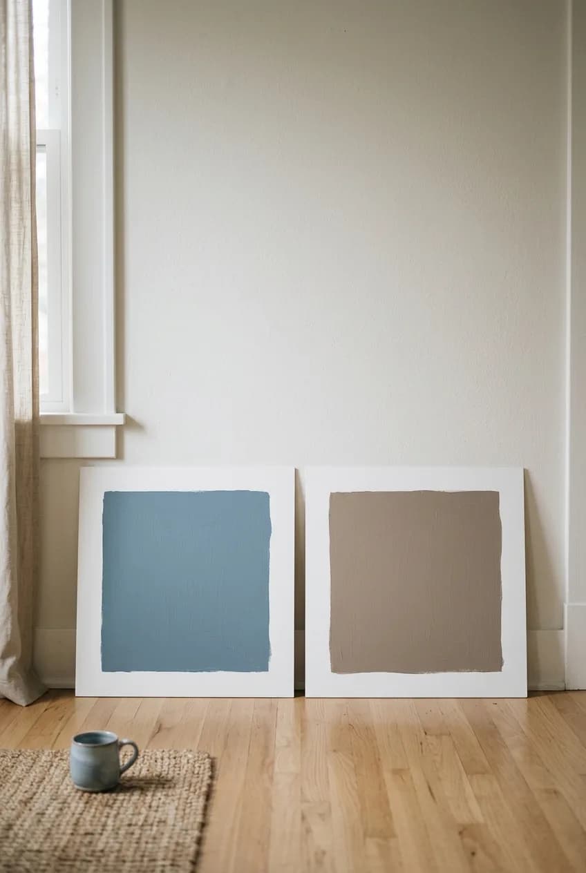
Just as you would on the final wall, you need two coats for true color depth. Let the first coat dry completely (check the can for recommended time, usually 1-2 hours) before applying the second. This is non-negotiable for seeing the real color.
Here’s a critical tip: Always leave a 1- to 2-inch white border around your painted sample on the board. This white space acts as a neutral buffer, visually isolating the new color from your current wall color when you tape it up. This allows your eye to judge the sample on its own merit, without being distorted by the color it's sitting next to.
Step 3: Label Everything
Once the second coat is dry, flip the board over and write the paint brand, color name, and number on the back with a marker. When you have three shades of 'greige' that look almost identical, you'll be glad you did this.
How to 'Live With' Your Samples for 48 Hours
With your beautiful, accurate sample boards ready, the observation phase begins. A color's personality changes throughout the day, so you need to give it at least 48 hours to see all its moods before you commit.
Move Them Around the Room
Using painter's tape, put your sample boards up on the wall. Don't just test them on one wall. Move them around! Place one on the main wall that gets the most direct sunlight, and put another on a wall that's typically in shadow. How does the color hold up in both bright and dim corners of the room? Does it wash out in the sun or become murky in the shade?
Observe at All Hours
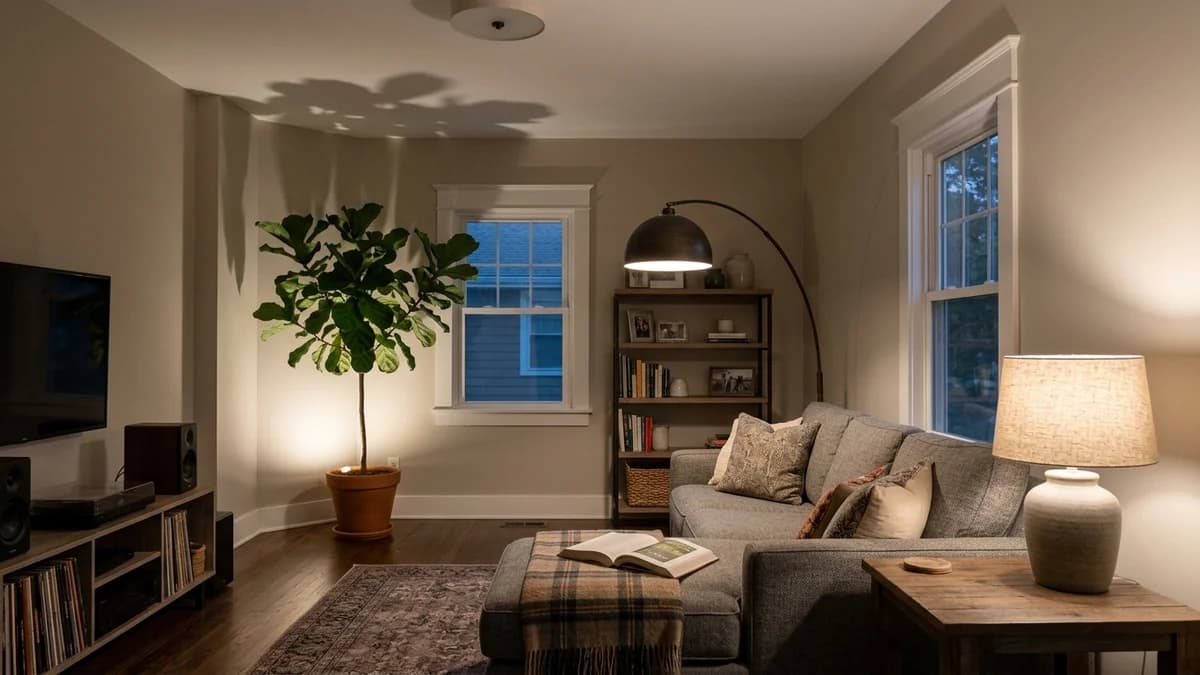
Make a point to look at the samples at different times. Check them in the crisp, cool light of early morning, in the warm glow of the late afternoon, and most importantly, at night with all your usual lamps and overhead lights turned on. This is where unwanted undertones (that surprise purple or green) love to appear. The color has to work with your artificial lighting scheme.
Test Against Your Fixtures
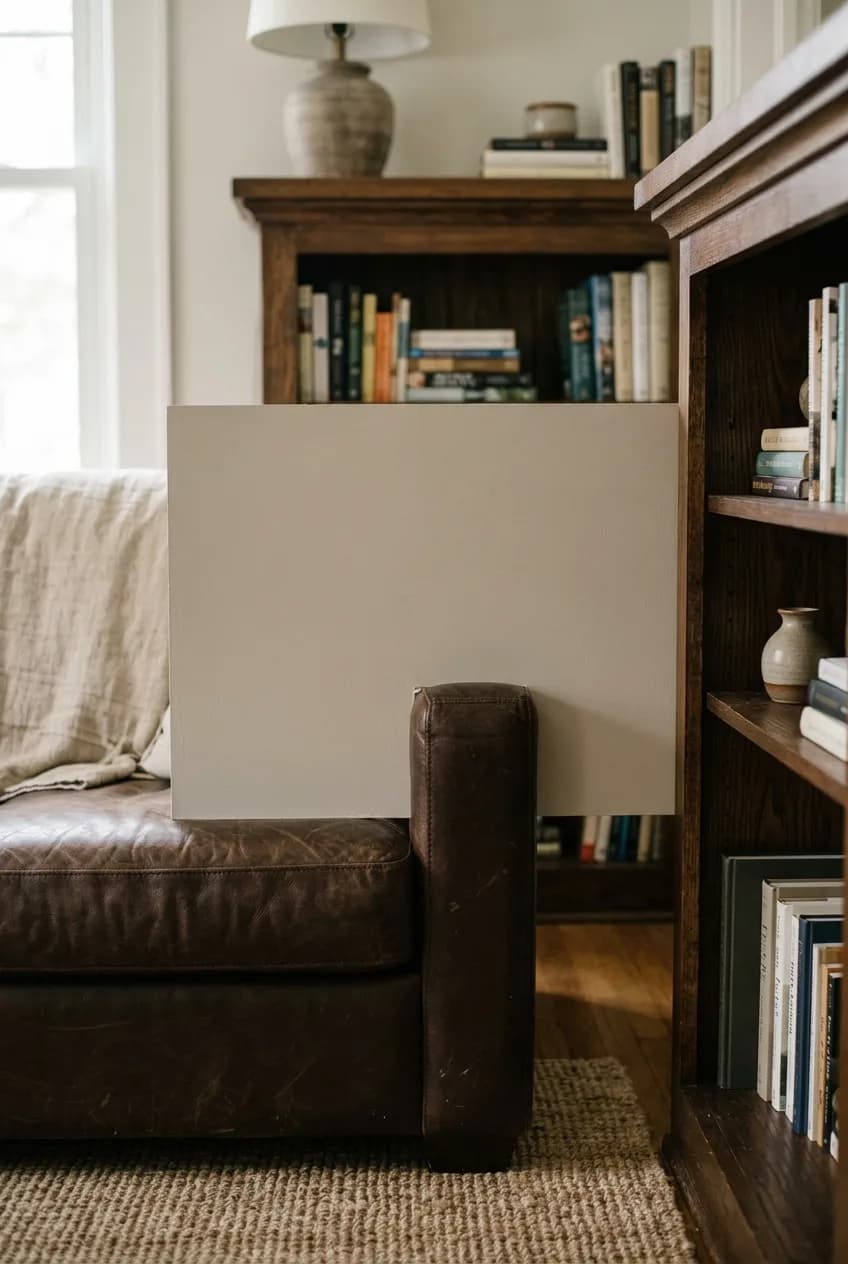
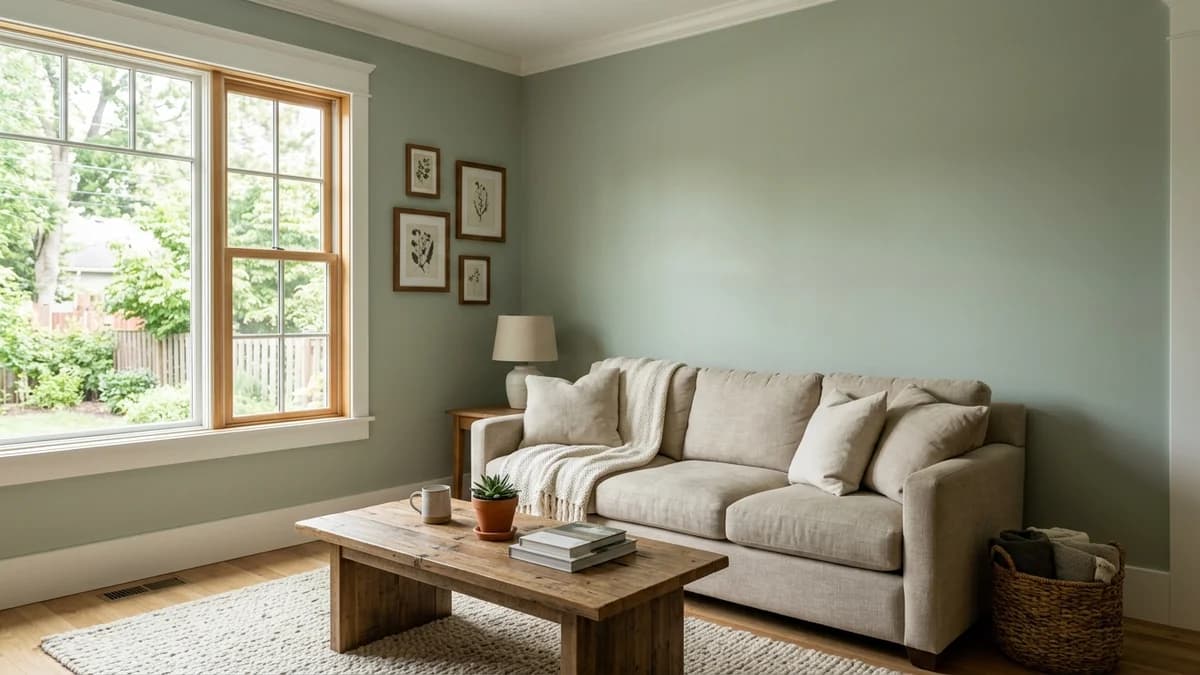
A paint color doesn't exist in a vacuum. You need to see how it interacts with the things that aren't changing. Place your samples right next to your window and door trim, against your kitchen cabinets or fireplace mantel, and near your flooring. Do the undertones complement each other or do they clash? The most critical test is to place a sample directly behind your sofa or next to your largest piece of art. These are dominant features in your room, and the wall color must work with them harmoniously.
Making the Final Call: How to Choose with Confidence
After a couple of days of observation, you should have a much clearer picture. Often, one color will emerge as the clear winner, looking great in all conditions. If you're still deciding between your final two or three, bring them together on your main wall.
Look at them side-by-side, but also try lining them up vertically on the wall. This arrangement better mimics how your eye will perceive the color on a full wall, from floor to ceiling, and can sometimes make the choice obvious.
What if none of them feel quite right? Don't settle. If you love a color but it's just a bit too dark or intense, go back to the paint store and ask them to mix it at 50% or 75% strength. This reduces the pigment load and gives you a lighter version of the same color family. And if you're really stuck between two very similar shades, here's a secret from the pros: the one that looks slightly more 'gray' or 'muddy' on the sample board will often look more expensive and balanced once it's on all four walls. The 'cleanest' and 'brightest' choice can easily become overwhelming when amplified across an entire room.