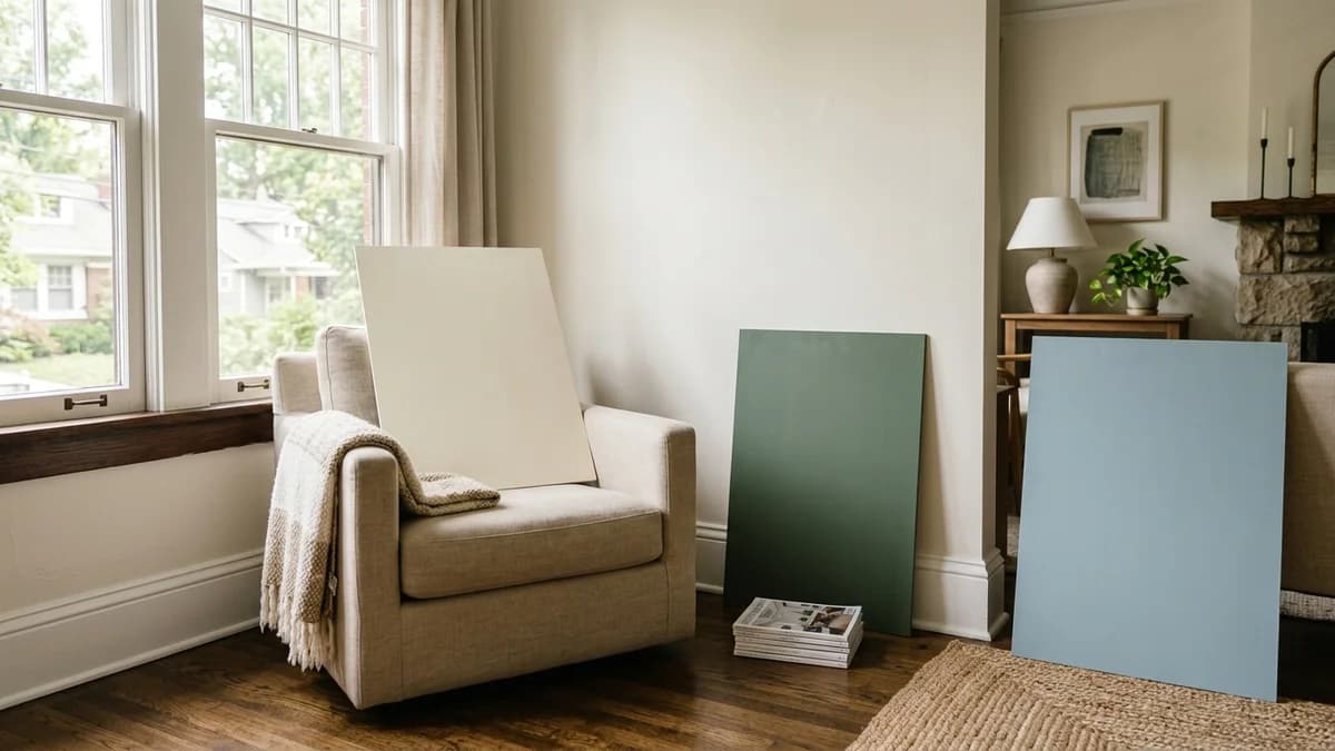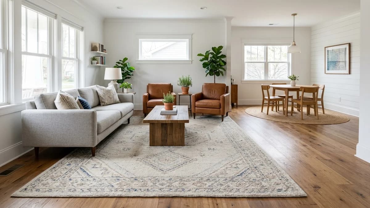
We've all got one: that tiny spare room or cozy-but-cramped living area. The go-to advice is often a coat of plain white paint to make it feel bigger, but what if you're craving some color and personality?
Thankfully, adding color doesn't have to mean making the walls close in. Two clever paint techniques can actually trick the eye: the focused drama of an accent wall and the architectural illusion of a two-tone treatment. One creates depth by drawing your gaze to a single point, while the other can visually lift a low ceiling, making a room feel taller and more structured.
The choice between them isn't about trends—it's a strategic decision. Let's dig into how each one works to manipulate space, so you can pick the perfect solution for your room.
The Single Accent Wall: Creating Depth and a Focal Point
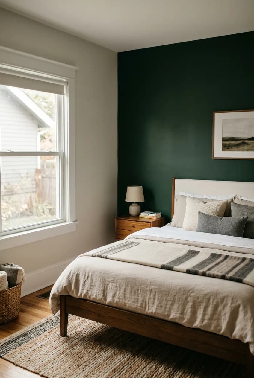
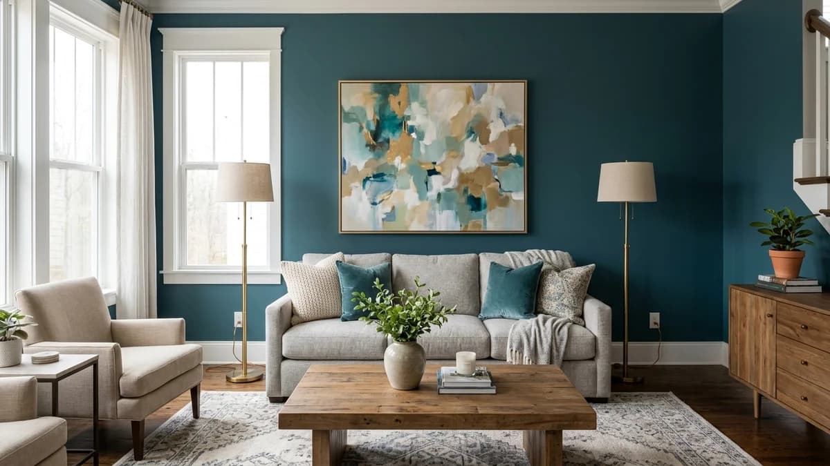
The single accent wall is the most familiar technique. The principle is simple: painting one wall a different, often darker or bolder, color than the others draws your eye directly to it. This visual pull creates an illusion of depth, making the room feel longer than it actually is. Think of it as pushing that one wall further away.
When to Use an Accent Wall
For small rooms, this can be incredibly useful. An accent wall is brilliant for defining zones, like creating a dedicated “office nook” in a studio apartment or a distinct dining area in an open-plan living space. It can also highlight a feature you love, like a fireplace or a beautiful window. An accent wall can definitely be a good idea for a small living room if your goal is to add depth or highlight a specific feature.
The Common Mistake (and How to Avoid It)
But be careful. Choosing the wrong wall can backfire, visually chopping up the space and making it feel disjointed and smaller. A common mistake is accenting a wall with too many doors or windows, which breaks up the color and diminishes the impact.
Here’s a tip a lot of people miss: the most effective accent wall in a small room is often not the first one you see upon entering. Instead, choose the solid, uninterrupted wall behind the largest piece of furniture, like your sofa or the bed's headboard. This anchors the room, creates a cohesive focal point, and gives the space a clear sense of purpose.
The Two-Tone Wall: Manipulating Height and Horizon
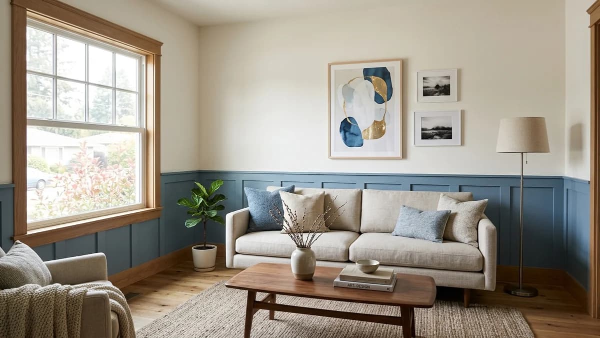
A two-tone wall involves splitting the wall horizontally with two different colors. This isn't just about paint; it’s about creating an architectural illusion. By establishing a strong horizontal line, you fundamentally change how the eye perceives the proportions of the room.
How Two-Tone Walls Trick the Eye
The primary superpower of this technique is its ability to alter the perception of ceiling height. A horizontal line tricks your brain into re-evaluating the vertical space. Depending on where you place that line and which colors you use, you can make a room feel taller and airier or cozier and more intimate. This makes it a fantastic tool for rooms with less-than-ideal proportions.
Unlike an accent wall, which focuses all the attention on one spot, a two-tone treatment wraps around the room, creating a sense of continuity and rhythm. This clever technique adds significant architectural interest without adding a single piece of physical clutter, making it a powerful tool for minimalist and maximalist small-space designs alike.
Placing the Line: Top vs. Bottom
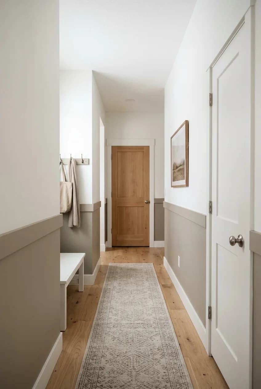
The placement of the line is everything. There’s no single rule, but here are the two most common approaches:
- Darker Color on the Bottom: This is the classic, go-to method for making a room feel taller. By placing a darker, heavier color on the bottom third or half of the wall, you ground the space. The lighter color on top then draws the eye upward, creating an illusion of higher ceilings. This is a nearly foolproof way to combat a low-ceiling room.
- Darker Color on the Top: This is a bolder, more dramatic choice. Painting the top portion of the wall a darker shade brings the ceiling down visually, creating a cozy, enveloping, and sophisticated feel. It's excellent for bedrooms or dens where you want a cocooning effect, but it’s best used in rooms that aren’t already suffering from low ceilings.
Head-to-Head: Which Technique Solves Your Room's Problem?
More in Home Decor
When Is the Best Time of Day to Test Paint Samples? The Definitive Guide
So, how do you choose? Forget which look is more trendy and instead ask: what problem am I trying to solve? Think of paint as a corrective tool, not just decoration. The 'better' choice is the one that directly addresses your room's primary flaw.
Your Goal | The Winner | Why It Works |
|---|---|---|
Make the room feel TALLER. | Two-Tone Wall | The horizontal line created by a darker bottom color and lighter top color draws the eye upward, creating a powerful illusion of height. It's the best choice for low ceilings. |
Make the room feel DEEPER or longer. | Accent Wall | Placing a darker color on the farthest short wall of a narrow room makes that wall visually recede, adding a sense of depth. |
Add interest without overwhelming the space. | Two-Tone Wall | A subtle, low-contrast two-tone scheme (like two shades of sage green) adds architectural character and balance without the singular, high-impact drama of an accent wall. |
Create a strong, singular focal point. | Accent Wall | This technique is purpose-built to scream, "Look over here!" It’s perfect for highlighting the wall behind a bed, sofa, or a piece of statement art. |
Before You Paint: Deciding Factors for Your Space
Before you head to the hardware store, take a moment to analyze the room itself. The right technique in the wrong room can fall flat. Consider these four key elements.
Natural Light and Ceiling Height
How much light does the room get, and from what direction? The direction your window faces is crucial. A north-facing room receives cool, indirect light all day. A dark, moody accent wall in such a room can feel gloomy and heavy. A brighter, low-contrast two-tone scheme might be a safer and more uplifting choice. In a south-facing room flooded with warm light, you can be much bolder with your color choices.
Your ceiling height is probably the single most important variable. If your ceilings are 8 feet or lower, a two-tone wall with the darker color on the bottom is almost always a better choice than an accent wall, which can make the room feel boxed in.
Furniture Layout and Desired Mood
Take a look at your furniture. Is there a natural focal point already? If your sofa and main art piece are on one wall, that wall is begging to be an accent wall. If your furniture is more spread out, a two-tone design can provide a unifying element that ties everything together.
Finally, what's the vibe you're after? If you want drama, focus, and a touch of boldness, the accent wall delivers. If you’re aiming for a space that feels structured, serene, and architecturally interesting, the two-tone wall is your friend. It provides character in a more subtle, holistic way.
The Verdict: A Quick Guide to Making Your Choice
There's no single winner, only the right tool for the job. The best technique is the one that thoughtfully addresses your room's specific challenges.
Go for a single accent wall if you have a clear, natural focal point—like the wall behind your bed—and your primary goal is to make the room feel deeper. It’s a confident, focused choice that adds instant drama.
Opt for a two-tone wall if your main goal is making low ceilings feel higher, or if you want to add balanced, architectural interest that wraps around the entire space. It’s a more subtle trick that adds character without shouting.
Ultimately, when you treat paint as a problem-solver instead of just decoration, you’ll create a space that doesn’t just look bigger—it feels intentional, cohesive, and uniquely yours.