Picking a paint color feels like it should be the fun part. You browse chips at the store, bring home a few favorites, and slap a small square on the wall. But if you've ever done this, you know the feeling of disappointment when the final, fully painted room looks nothing like that little swatch you loved in the hardware store aisle. What went wrong?
The culprit is almost always light. The time of day you check your paint sample can make the difference between a color you adore and a costly, frustrating repaint. Forget trying to find a single perfect moment; the secret is a simple testing schedule that reveals how your chosen color will behave in your specific room, from bright morning sun to cozy evening lamplight.
Why the Time of Day Drastically Changes Your Paint Color
Have you ever noticed how a color can seem to shift and change right before your eyes? This isn't a trick of the imagination. It's a real phenomenon called 'metamerism,' and it's why a paint color that looks like a soft greige in the store can turn into a muddy beige or even a pale lavender on your walls. It all depends on the light source.
The Science of Shifting Light
Natural daylight is a moving target. The light around noon is relatively balanced, even cool and blueish. Just a few hours later, the late afternoon sun introduces strong yellow and red tones that can completely change a color's character. Testing a color at only one time of day gives you a single, incomplete snapshot.
The Real Goal of Testing
Getting this wrong isn't just about the cost of paint. It's the nagging feeling of living in a room that just feels 'off.' So, remember: the goal isn't to find the one 'true' color of the paint. It's to see all its personalities as the light moves through your room and decide if you love every one of them.
The Ideal 24-Hour Paint Testing Schedule
To get a complete picture of your paint color, you need to observe it at three critical times. Instead of a single glance, think of this as a series of check-ins. It's a good idea to snap a quick photo on your phone at each time to easily compare the shifts later.
Time of Day | Type of Light | What to Look For |
|---|---|---|
Mid-Morning (around 10 AM) | Clear, bright, indirect light | This is often the most neutral light. Does the color feel clean and true to the chip, or does it wash out? |
Late Afternoon (around 4-5 PM) | Warm, angled, golden light | The warm tones will bring out undertones. Does your gray suddenly look purple? Does your beige turn too yellow? |
After Dark (with lights on) | Artificial light (your lamps/fixtures) | This is how the room will look most evenings. Does the color maintain its character or become dull and muddy? |
Also, consider your lifestyle. Try to check the samples on both a typical weekday and a weekend day. The ambient light in your home can be different if you have the blinds open on a Saturday versus drawn on a Tuesday morning when you're rushing to work. It all contributes to the final effect.
Here's a tip: that beautiful 'golden hour' light that photographers love is actually one of the worst standalone times to judge paint. Its extreme warmth is beautiful but fleeting, and it can make almost any color look appealingly warm and glowy, which can be very misleading for the other 23 hours of the day.
How Your Room's Direction Dictates the Best Light
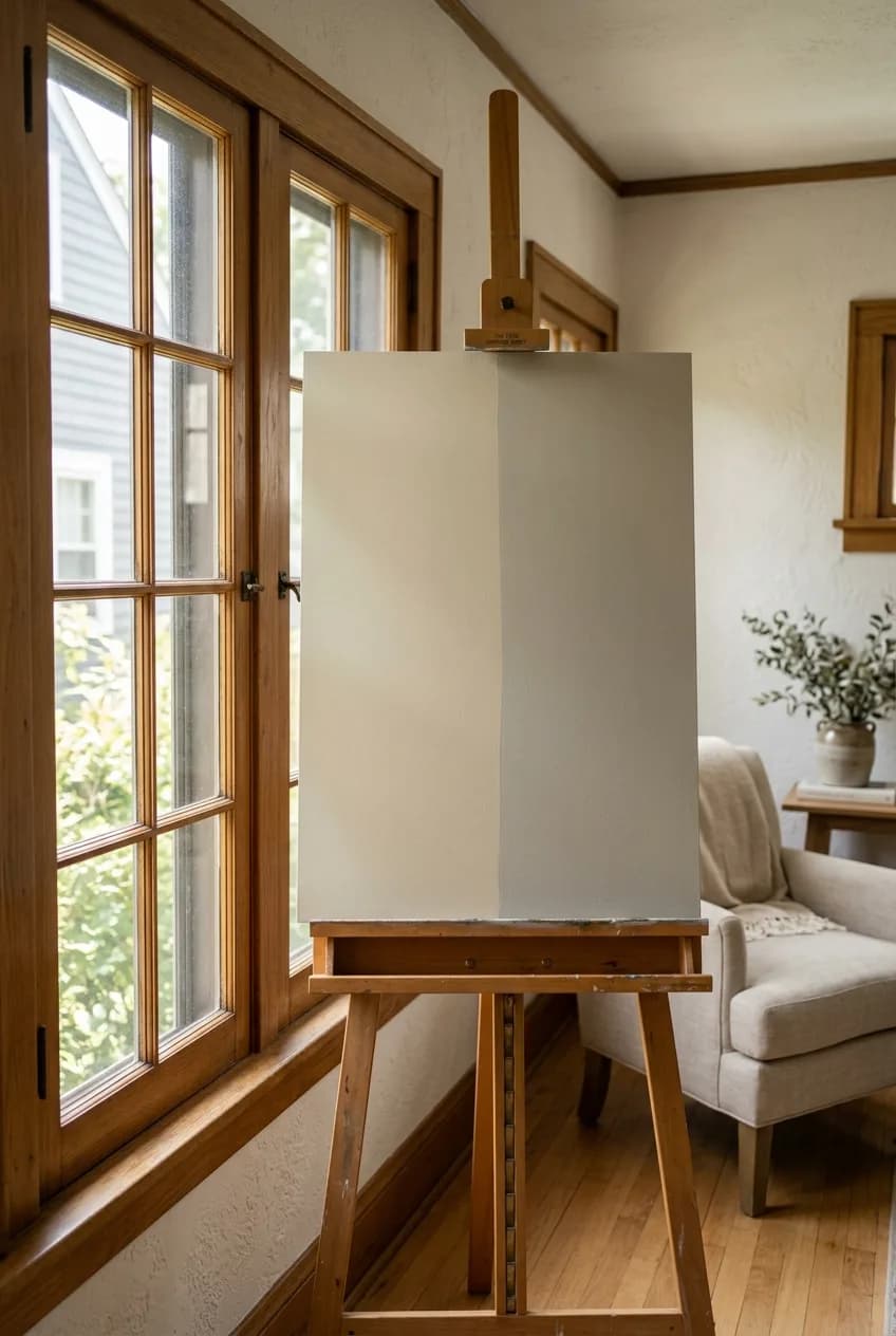
Beyond the time of day, the direction your room's windows face is the single biggest factor in the quality of natural light it receives. A paint color that looks perfect in your friend's bright, south-facing living room can look disappointingly drab and flat in your north-facing one, even if you test it at the same time. You have to test colors in the specific room they are destined for.
North-Facing Rooms
These rooms get indirect light all day, which is cool and blue-toned. This consistent light can be great for a study or studio, but it has a tendency to wash colors out or bring out their grayest undertones. Bolder, warmer colors often work well here to counteract the coolness, while delicate, cool-toned pastels might look colder than you intended.
South-Facing Rooms
The dream for lovers of light! South-facing rooms are flooded with intense, warm-toned light for most of the day. This beautiful light can make most colors look good, but it can also make warm colors (like beiges and creams) appear much more yellow than they do on the paint chip. Cooler colors can be a great way to balance the intensity of the sun.
East- and West-Facing Rooms
These rooms are chameleons. East-facing rooms get bright, clear light in the morning and then become cooler and dimmer in the afternoon. West-facing rooms are the opposite: they can be dim in the morning and then get blasted with intense, warm, almost orange light as the sun sets. When choosing a color for these rooms, you have to decide which time of day is more important to you. Do you want the color to pop during your morning coffee or look cozy during sunset?
More in Home Decor
The Ultimate Guide to Choosing a Rug Size for an Open Floor Plan
The Overlooked Step: Testing Under Artificial Light at Night
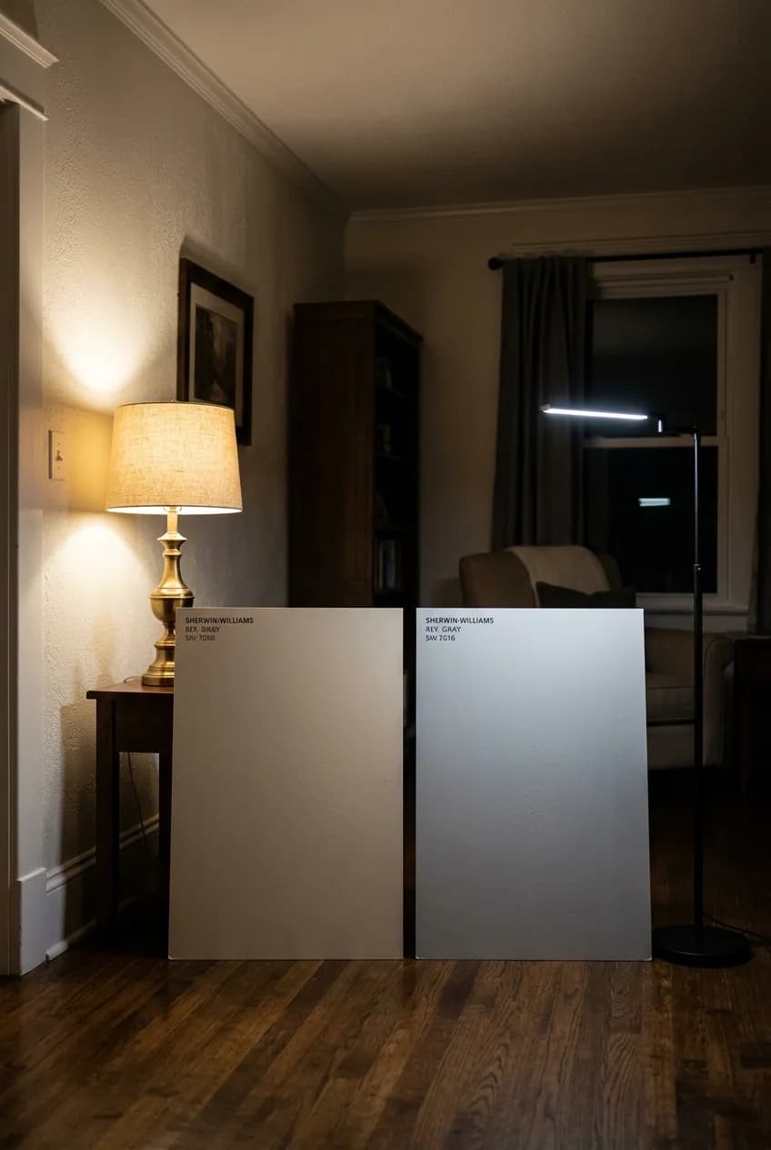
This might be the most-skipped step in paint testing, and it's arguably the most critical. For living rooms, dens, and bedrooms, you likely spend most of your waking hours in them after the sun has gone down. How the color looks under your lamps and overhead lights is paramount.
Check the Kelvin: Your Bulb Is the Real Boss
It's essential to test with the exact light bulbs you plan to use in the finished room. The color temperature of your bulbs, measured in Kelvins (K), has a massive, more consistent impact than even the afternoon sun. A 'warm white' bulb (around 2700K) casts a cozy, yellowish glow, while a 'daylight' bulb (4000K-5000K) gives off a much bluer light. A low-Kelvin bulb can easily turn a sophisticated, cool gray into a muddy, uninspired beige the moment you flip the switch. Bring your sample boards into the room at night, turn on all the lights you typically use, and see what happens.
Beyond Timing: Best Practices for Accurate Color Testing
Observing your sample at the right times is half the battle. The other half is ensuring your testing method is as accurate as possible. A few simple techniques can save you from a world of color confusion.
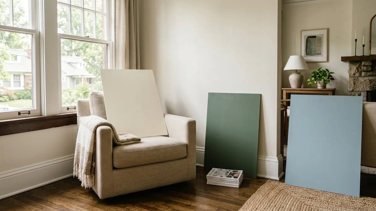
Use Large, Movable Sample Boards
Painting a small test swatch directly onto your current wall is the least accurate method. The existing color surrounding your swatch will trick your eye and distort your perception of the new shade. Instead, get large sample boards. You can buy pre-made peel-and-stick samples from companies like Samplize, or simply paint two coats of your sample paint onto a large piece of white poster board.
Check Samples on Multiple Walls
The beauty of a sample board is that you can move it around. A color will look completely different on the wall that gets direct sunlight versus the wall in a darker corner of the same room. Place your sample board on each wall you plan to paint to see how it performs in different lighting conditions within the space.
View Samples Against Existing Finishes
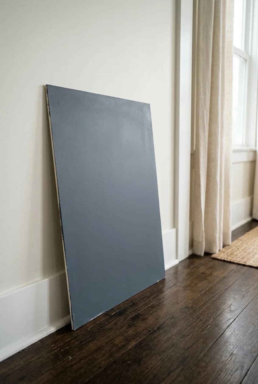
Your paint color doesn't exist in a vacuum. It has to work with your trim, flooring, and large furniture pieces. Before making a final decision, place your sample board so it's directly touching your window trim, your baseboards, and the floor. Set it on a sofa cushion or prop it up next to your wooden bookcase. This context is crucial for seeing the true, final effect and avoiding unpleasant clashes.