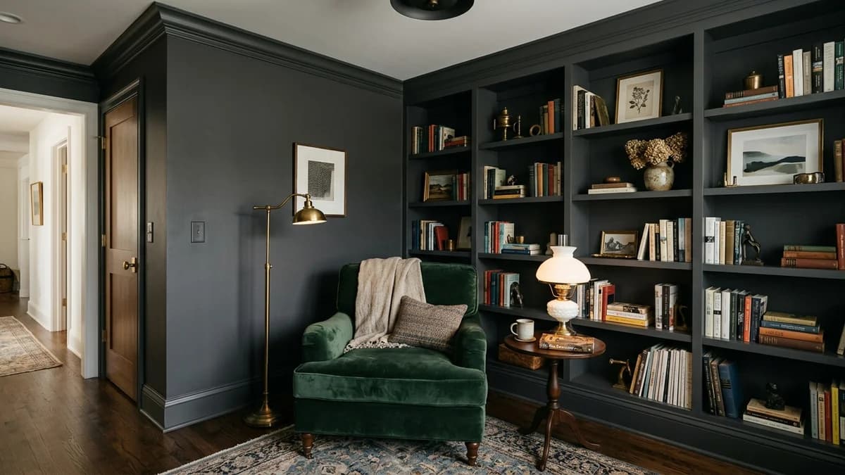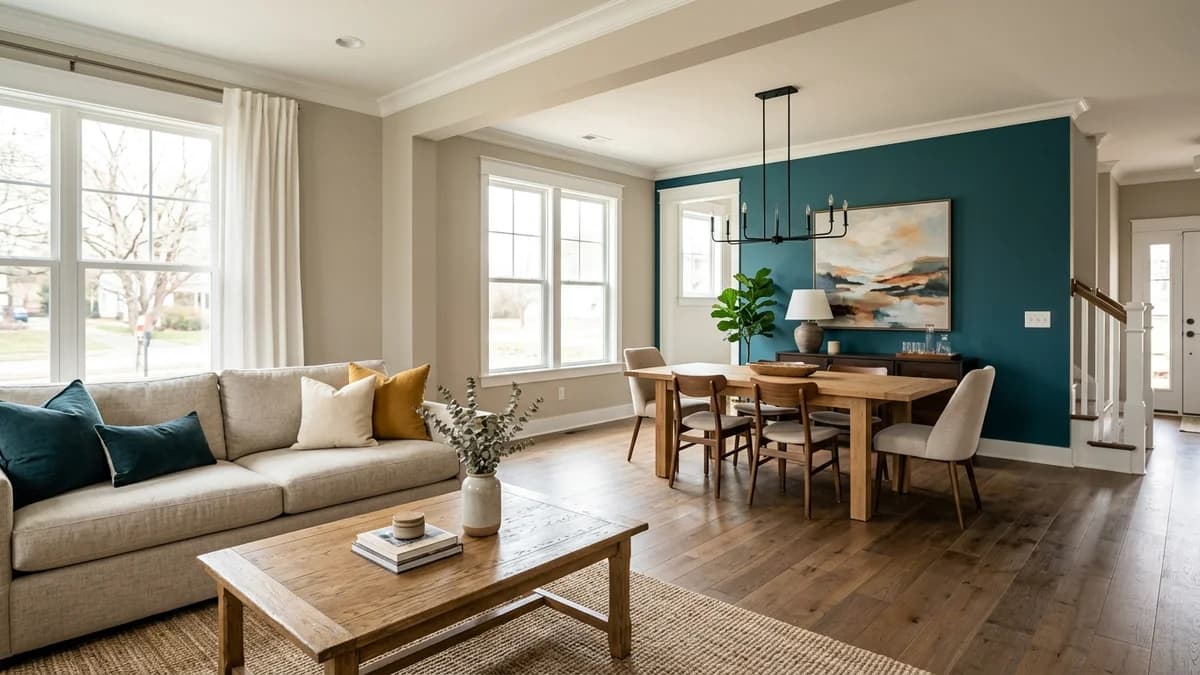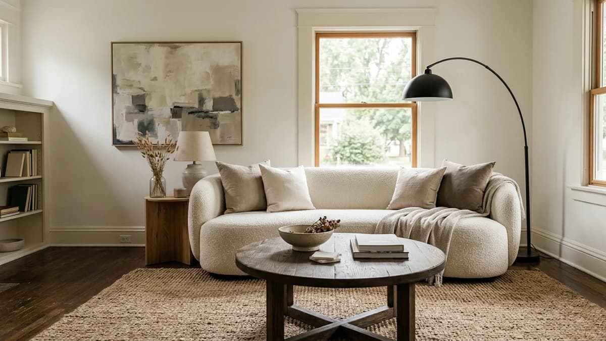
You did everything right. You chose a sophisticated palette of beige, white, or gray, aiming for that serene, light-filled space you see in magazines. But now that it's done, something feels… off. Instead of calm and curated, your room feels flat, sterile, or just plain boring. What went wrong?
It’s a common frustration, but the good news is that the problem isn't your color choice. The secret that design professionals know is that a neutral palette isn't a complete design concept—it's the canvas. A boring neutral room is an unfinished room, not a badly colored one.
Let’s walk through the four key strategies the pros use to transform a one-note neutral space into a room that feels rich, layered, and deeply personal. It's all about what you add *after* you've picked the paint.
The Common Trap: Why Your Neutral Room Feels 'Off'
Before we dive into the solutions, it helps to diagnose exactly why your room isn't working. Most often, it comes down to one of two issues. First, there's the mistake of thinking 'neutral' is a single decision. You paint the walls greige, buy a greige sofa, and lay down a greige rug. The result? A monotonous space where nothing stands out because everything is the same tone, texture, and finish.
The second common pitfall is the 'showroom effect.' This happens when everything in the room is brand new and coordinates a little too perfectly. It lacks the layers of history, personality, and varied materials that make a house feel like a home. Without these layers, even the most beautiful furniture can feel cold and impersonal, like a catalog photo rather than a real, lived-in space.
The core problem is a lack of variation. The eye needs different textures to scan, different shapes to follow, and subtle tonal shifts to perceive depth. When these are missing, the brain reads the environment as uninteresting and sterile. But don't worry, this is the easiest design problem to solve.
Professional Secret #1: Layer Textures for Tactile Depth
If you take away only one piece of advice, let it be this: texture is the single most important tool for creating an interesting neutral room. In a colorful room, different hues provide visual stimulation. In a neutral room, texture does that heavy lifting. It creates subtle shadows and highlights, making the space feel rich, complex, and inviting.
Why Texture is Your Secret Weapon
Think about how things feel to the touch. A nubby wool blanket, a smooth leather chair, a rough-hewn wooden bowl, a sleek metal lamp. Each of these materials reflects light differently and adds a unique character to the room. When you mix them, you create a dynamic environment that engages more than just your sense of sight. It’s the difference between a room that looks good and a room that *feels* good to be in.
A common mistake is sticking to only soft textures, like cotton and microfiber. A truly layered room needs a broader range. The goal is to create a pleasing tension between contrasting surfaces.
A Mix-and-Match Texture Palette
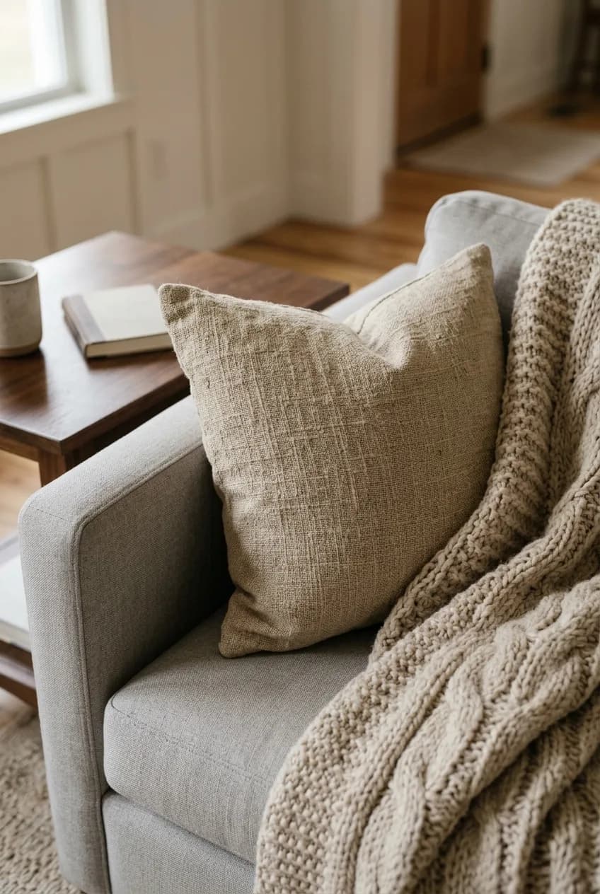
Start building your texture collection by aiming for at least three to four different materials in any given space. A great starting point is to have something soft, something rough, something smooth, and something natural.
Texture Type | Feels Like | Examples |
|---|---|---|
Soft & Plush | Cozy, comforting, luxurious | Bouclé, velvet, chunky knit wool, faux fur, chenille |
Rough & Natural | Earthy, organic, grounding | Jute or sisal rugs, linen curtains, woven baskets, stone coasters |
Smooth & Sleek | Modern, refined, reflective | Leather upholstery, polished metal lamps, ceramic vases, glass tabletops |
Warm & Organic | Timeless, solid, character-rich | Wood grain (coffee tables, bowls), aged brass, rattan furniture |
Professional Secret #2: Play with Form and Silhouette
Take a quick scan of your room. What shapes do you see? If your answer is mostly rectangles and squares—a boxy sofa, a rectangular coffee table, a square area rug—you've likely found another source of the 'boring' feeling.
A room's energy comes from the interplay of its lines. A space dominated by predictable, 90-degree angles will feel static and rigid, regardless of its color palette. To breathe life into your neutral room, you need to introduce some curves and unexpected shapes. This simple change can dramatically alter the flow and feel of the space.
Think about swapping one major piece. A round coffee table instantly softens a seating area defined by a straight-lined sofa. A sofa with a gentle curve can make a living room feel more conversational and welcoming. Even smaller additions have a huge impact: consider an arched floor-length mirror to break up a flat wall, a sculptural floor lamp with an organic shape, or a collection of round decorative trays on a console.
Don't forget to consider the negative space—the empty area around your furniture. Interesting shapes create more dynamic negative space, which is just as crucial to a well-composed room as the objects themselves. An arc or a curve guides the eye through the room, creating a sense of movement that straight lines can't achieve on their own.
Professional Secret #3: Master Monochromatic Tonal Variation
When a designer says they are creating a 'white room,' they never mean a room painted in a single shade of white. The same goes for beige, cream, or gray. A truly sophisticated neutral room is built from a carefully curated family of related tones, not just one.
More in Home Decor
Hiring a Color Consultant: Is It Worth It or Can You DIY?
This technique of layering different shades of the same color is what gives a monochromatic space its depth and prevents it from looking flat. Your brain perceives these subtle shifts in tone as complexity and sophistication. It’s the difference between a room that feels stark and one that feels serene and intentional.
Start with your main color—let's say it's a warm beige on the walls. Now, build around it with lighter and slightly darker variations.
- The 'Warm White' Family: If your walls are a crisp white, layer in elements of ivory, natural linen, soft cream, and even a hint of the palest mushroom.
- The 'Beige' Family: For a beige room, introduce pieces in sand, oatmeal, camel, and a deep tan to create warmth and dimension.
- The 'Greige' Family: If you love the mix of gray and beige, build on it with tones of taupe, stone, and a light, silvery gray to keep it from feeling muddy.
Apply these variations across different elements. Your sofa might be a light oatmeal, your curtains a creamy ivory, your rug a deeper taupe, and your throw pillows a mix of all three. Each piece remains neutral, but together they create a rich, harmonious tapestry of color.
Professional Secret #4: Add Strategic Points of Contrast
After you’ve layered your textures and tones, your room will feel much richer. But for a truly professional touch, you need one final element: a point of contrast. A perfectly harmonious neutral room can sometimes feel a bit hazy or undefined. It needs a single point of tension to make everything else feel more purposeful.
The Power of a Grounding Element
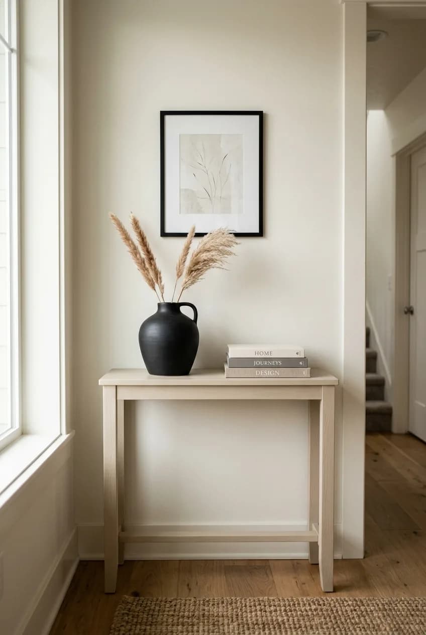
Think of this as a visual anchor. In a sea of light-to-mid-tone neutrals, a small, deliberate touch of black or a very dark tone provides a grounding element that stops the room from floating away. It gives the eye a place to rest and, in doing so, makes the surrounding lighter tones appear more crisp and intentional.
This doesn't mean you need to add a black accent wall. The power of this technique is in its subtlety. Often, all you need is a few small, well-placed items.
- Black Metal Accents: Thin black picture frames, the legs of a coffee table, a floor lamp, or window hardware.
- Dark Wood: A single dark walnut bowl on a light oak table, a dark-stained tray, or a piece of reclaimed wood.
- Rich-Toned Leather: A cognac or charcoal leather accent chair or ottoman.
- Dark Artwork or Pottery: A piece of abstract art with bold black strokes, or a matte black ceramic vase.
How Much Contrast is Enough?
The key is to use contrast like punctuation—sparingly and with intent. You don't need a lot to make a big impact. In a typical living room, three to five small points of black or dark charcoal are often enough to tie the space together. It could be as simple as the frames on your gallery wall, the base of your reading lamp, and a single black throw pillow. This small thread of darkness provides structure and makes your beautiful neutral palette truly sing.