Have you ever spent a weekend meticulously painting a room, only to step back and feel… disappointed? The color that looked so perfect on the tiny paint chip now feels flat, or too bright, or just plain wrong. It’s a uniquely frustrating experience, and it often happens because we’re following outdated 'rules' that simply don’t work in modern homes.
Blindly following these common paint color myths is why so many rooms feel unfinished or simply fall flat. It's time to set aside that old advice. We’ll walk you through the most persistent myths and give you the practical, actionable strategies to choose colors with confidence, avoid the headache of a repaint, and finally get the beautiful room you envisioned.
Myth #1: Small Rooms Must Be Painted White or a Light Color
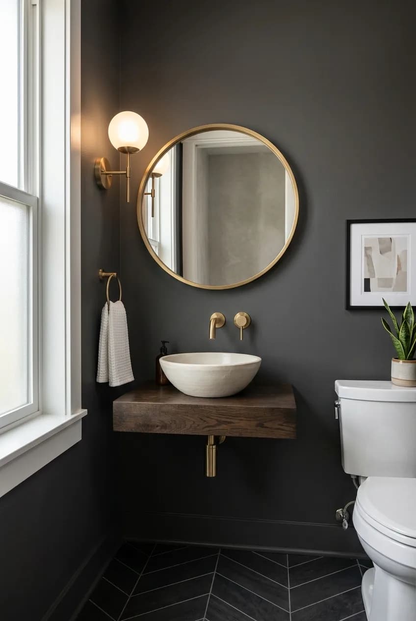
This is probably the most repeated piece of paint advice in history. The logic seems sound: light colors reflect light, making a space feel bigger. But does 'bigger' always mean 'better'? Not at all. In fact, sticking to a bland white in a small room without much natural light can often make it feel less like an airy retreat and more like a sad, undefined box.
Instead, consider embracing the size of the room with a deep, saturated color. Think rich navy, charcoal gray, or a dramatic forest green. Dark colors have a fascinating effect in tight quarters; they can actually blur the boundaries of the room. The corners and edges recede, creating an illusion of depth and a cozy, enveloping atmosphere. This transforms a cramped space into an intentional 'jewel-box' that feels intimate and sophisticated.
The real key isn't the shade, but the lighting. A dark color in a well-lit room (even with good artificial light) will look luxurious. A light color in a room with poor, shadowy light will just look dingy. This approach works wonders in spaces like powder rooms, a small home office, or even a compact entryway where you want to make a strong first impression.
The insight here is that the goal isn't always 'spaciousness'; sometimes it's 'sophistication' or 'intention'. A bold color choice feels deliberate and expensive, while a default white can signal a lack of imagination. You're not trying to trick anyone into thinking your powder room is a ballroom; you're creating a mood.
Myth #2: Ceilings and Trim Must Always Be Crisp White
There's a reason contractor-white is the default for ceilings and trim. It's safe, it reflects light downward, and it provides a clean, crisp contrast that makes wall colors pop. And sometimes, that's exactly what a room needs! But treating it as an unbreakable rule means you're missing out on some incredible design opportunities.
Think of the ceiling as the 'fifth wall' of your room—a huge, uninterrupted canvas that can completely change the feel of the space. Moving beyond basic white opens up a world of sophisticated options.
Create a Seamless, Taller Look
For a subtle and elegant effect, paint the ceiling a lighter tint of your wall color. Ask the paint store to mix a version of your wall color with 50% or 75% white. This softens the harsh line where the wall meets the ceiling, drawing the eye upward and making the room feel taller and more cohesive. It’s a custom look that feels incredibly high-end.
Embrace Modern 'Color Drenching'

More in Home Decor
Warm White vs. Cool White Paint: How to Choose the Perfect Shade for Your Living Room
For a bold, contemporary statement, paint the trim the *same* color as the walls. This technique, often called 'color drenching,' makes a room feel larger and less busy because the eye isn't constantly interrupted by contrasting lines of white trim. It creates a calming, unified backdrop that lets your furniture and art take center stage.
The insider trick here is to play with sheen. Paint the walls in a lower sheen, like eggshell or matte, and use a slightly higher sheen, like satin or semi-gloss, for the trim in the exact same color. This creates a subtle, textural layer that catches the light differently, adding depth and a sophisticated finish without introducing another color.
Frame Your Space with Contrast
What if your home has beautiful, substantial molding? Don't hide it—highlight it! Instead of white, consider painting your trim a darker, contrasting color. A soft black or deep gray trim against a lighter wall can look strikingly chic, framing your doorways and windows like pieces of art and emphasizing the room's architectural character.
Myth #3: You Need an Accent Wall to Add Interest
The accent wall was the go-to design move for years. It was a way to dip a toe into the world of bold color without committing to a whole room. But more often than not, the result looks random and disconnected, visually chopping up a room and making it feel smaller and disjointed.
The problem is that an accent wall often lacks purpose. Why *that* wall? If there isn't a strong architectural reason, it can feel arbitrary and dated. A poorly chosen accent wall just draws attention to the least interesting part of your room—like a blank wall in the living room—creating an artificial focal point that feels unbalanced.
There are far more integrated and modern ways to bring in a pop of color. Consider painting the back of a built-in bookshelf a deep, moody shade. Paint an interior door (and its trim!) a glossy, unexpected color. Or fully commit and use the 'color drenching' technique mentioned earlier to create immersive, intentional drama.
This isn't to say an accent wall *never* works. It absolutely can, but only when it highlights a room's inherent strengths. Does your bedroom have a beautiful architectural niche behind the bed? Is there a stunning fireplace that deserves to be the star? In those cases, a feature wall can be a powerful tool. But if you're just painting one random wall a different color, it's time to rethink the strategy.
Myth #4: Neutral Palettes Have to Be Boring (or Beige)
When you hear the word 'neutral,' your mind probably jumps straight to beige, off-white, or maybe a shade of gray. For decades, those were the safe, go-to choices. But 'neutral' doesn't have to mean 'devoid of color.' It's time to broaden your definition.
A modern neutral is any color that is complex and muted enough to serve as a versatile backdrop for your decor. Think about those beautiful, hard-to-pin-down colors: a dusty sage green, a faded terracotta, a grayish-blue, or even a soft, chalky black. These 'new neutrals' have far more character and warmth than their beige counterparts, yet they don't scream for attention. They create a sophisticated mood that feels both timeless and personal.
The key to using these complex neutrals successfully is understanding their undertones. A gray paint isn't just gray; it might have green, blue, or even purple undertones that will be brought out by the light and furnishings in your room. Holding a sample up to your sofa, rug, and wood floors is critical to ensure the undertones play nicely together and create a cohesive feel.
But the real secret to a stunning neutral room isn't just the wall color—it's texture. A room painted in a complex, moody green comes alive when you pair it with a variety of materials. The nubby texture of a linen sofa, the smooth warmth of a walnut credenza, the soft sheen of a velvet pillow, and the cool gleam of a brass lamp. That interplay of textures is what elevates the space from simply neutral to truly rich and inviting.
The Costliest Myth of All: Trusting a Tiny Paint Chip

This is the myth that leads to the most expensive and time-consuming mistakes. You hold up a tiny 2-inch paper square in the harsh fluorescent lighting of the hardware store and try to imagine what it will look like across hundreds of square feet of wall in your own home. It’s a recipe for disaster.
Why Paint Chips Lie
A small chip simply cannot tell you the whole story. First, the scale is all wrong; a color looks exponentially more intense when it covers a whole wall. Second, the color of everything else in your room—your floors, your furniture, even the green trees outside your window—will cast a reflection and change the way the paint color is perceived. Finally, and most importantly, light changes everything. The warm morning sun, the cool afternoon light, and the yellow glow of your evening lamps will make a single paint color look like three different shades.
Your Foolproof 4-Step Testing Process
You aren't just testing a color; you're testing a color in *your* unique environment. Spending $15-20 on a few samples is the best insurance you can buy against the hundreds of dollars and full weekend it takes to repaint a room you can't stand. Follow these steps and you'll never choose the wrong color again.
- Narrow It Down: Start with the paint chips to pick 3-4 finalists. Don't torture yourself with ten options.
- Get Large Samples: Buy small sample pots or, even better, large peel-and-stick swatches (like those from Samplize or SureSwatch). If using pots, paint them on two coats onto large white poster boards, leaving a white border around the edge.
- Place Them Strategically: Don't just stick the samples in the middle of a white wall. Place them right up against your trim, next to your sofa, near the carpet, and in a dark corner. You need to see how the color interacts with the fixed elements in your room.
- Watch for 24 Hours: This is the most important step. Move your samples around the room and observe them throughout the day. Look at them in the direct morning sun, in the afternoon shade, and at night with your lamps and overhead lights on. The perfect color will be the one you love in all these different conditions.