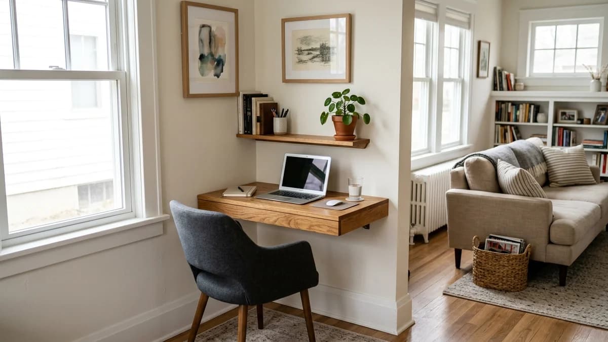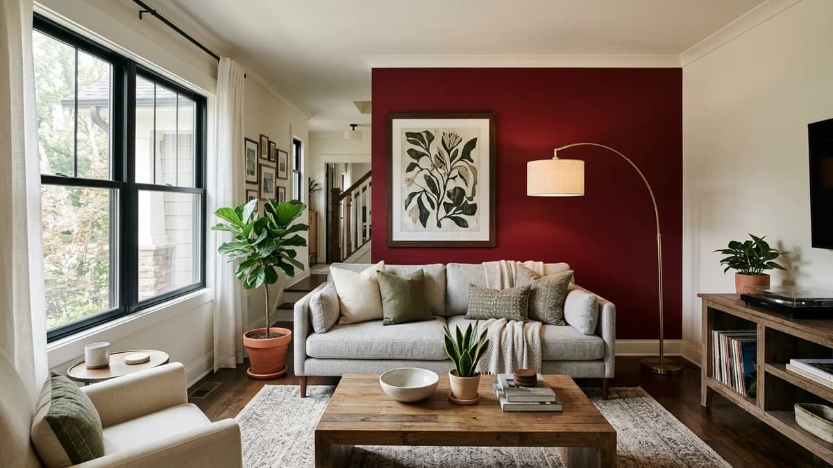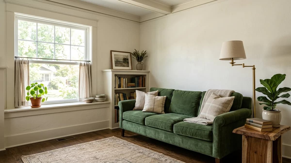
When you have a small living room, the default advice is always the same: "Just paint it white." And while there's nothing wrong with a crisp white room, that one-size-fits-all answer misses the point entirely. Choosing a paint color isn't just about making a room feel bigger — it's about making it feel *better*. It's about making it feel intentional, cozy, and perfectly suited to how you use it.
The right color can do more than just coat your walls; it can manipulate light, blur boundaries, and create a mood. A color that feels expansive and airy in one room might feel cold and sterile in another. Forget the idea that your options are limited. Let's walk through how to strategically pick a color, whether it's a soft neutral or a dramatic jewel tone, that makes your small living room your favorite room in the house.
Before You Pick a Swatch: It's All About the Light
Before you even think about specific shades, you need to become a student of your own room. The single biggest factor influencing how a paint color will look on your walls isn't the color itself, but the light that hits it. A gallon of the exact same paint can look completely different from one house to the next, or even from one wall to the next.
Assess Your Natural Light
The direction your windows face is the most critical factor, dictating the quality and temperature of the light your room receives throughout the day. A cool gray that looks chic and modern in a bright, south-facing room can look like unpainted concrete in a darker, north-facing one. It's a non-negotiable first step.
- North-facing rooms: Receive cool, indirect light. Colors can appear darker and bluer than they do on the swatch. Warm neutrals, yellows, and colors with a bit of warmth in them can counteract the chill.
- South-facing rooms: Get bright, warm light for most of the day. This is the most forgiving type of light! Both cool and warm colors work well, but intensely warm colors can sometimes feel overwhelming.
- East-facing rooms: Have bright, warm light in the morning that becomes cooler and bluer in the afternoon. A color needs to look good in both scenarios. Greens and blues often perform well here.
- West-facing rooms: Are darker in the morning but receive intense, warm, almost orange light in the late afternoon and evening. Warm neutrals are a great choice to lean into that golden-hour glow.
Understand Light Reflectance Value (LRV)
On the back of most paint chips, you'll often see a number labeled "LRV." This stands for Light Reflectance Value, and it's a simple scale from 0 (absolute black) to 100 (pure white) that tells you how much light a color reflects. The higher the number, the more light it will bounce around the room.
For a small room where you want to maximize brightness, aiming for an LRV of 60 or higher is a great rule of thumb. This doesn't mean you *must* choose a light color, but it helps you understand the physics of what you're choosing. A dark color with an LRV of 10 will absorb light, creating a cozier, moodier feel, while a light gray with an LRV of 65 will help amplify the available light.
Consider Your Artificial Lighting
Your room's color story doesn't end when the sun goes down. The type of light bulbs you use can dramatically alter a paint's appearance. Standard incandescent and "warm white" LED bulbs cast a yellowish light that enhances reds, oranges, and yellows, but can make some cool blues and grays look muddy. "Cool white" or "daylight" bulbs cast a bluer light, which will amplify blues and greens while potentially washing out warmer tones.
Be sure to test your paint swatches at night with your lamps on to ensure you still love the color after dark.
The Classic Approach: Using Light Colors to Maximize Space
There's a reason light colors are the classic choice for small spaces: they work. By reflecting more light, they create an airy, open feeling that can make a room feel larger than its actual square footage. But this doesn't mean you're stuck with stark, clinical white.
The key is to choose light neutrals with a bit of complexity. Look for off-whites with a hint of warmth, soft grays that don't feel cold, or even pale, muted pastels like blush or sage. The secret is understanding a color's undertone—the subtle color lurking beneath the main shade. An off-white might have a yellow undertone that makes it feel creamy and sunny, or a pink undertone that gives it a soft glow. Hold your paint chip up to your sofa, rug, and flooring to ensure the undertones are compatible.
More in Home Decor
11 Sophisticated Cherry Red Accent Wall Ideas for a Bold Living Room
For a truly seamless look, try painting the walls, trim, and even the ceiling in the exact same color. This erases the hard lines and visual stops that can chop up a small room, drawing the eye upward and making the space feel taller and more cohesive. The non-obvious pro tip here is to paint the ceiling the same color as the walls, but in a flatter sheen (like flat or matte). This avoids the jarring white 'lid' effect that can visually lower a ceiling, creating a more expansive, cloud-like feeling overhead.
Color Family | Why It Works | Best For... |
|---|---|---|
Warm Off-Whites | Creates a creamy, inviting glow. More forgiving and cozy than stark white. | North-facing rooms or any space you want to feel sunny and bright. |
Soft Grays | Sophisticated and versatile. Can feel modern or traditional depending on the undertone (blue, green, or violet). | South-facing or well-lit rooms where they won't look too cold. |
Greige (Gray + Beige) | The perfect neutral. Balances the warmth of beige with the modern feel of gray. | Almost any lighting situation. A true chameleon color. |
Muted Pastels | Adds a touch of personality and color without overwhelming the space. Think dusty blush, pale sage, or sky blue. | Rooms where you want a serene, gentle atmosphere. |
The Counterintuitive Choice: Go Dark and Dramatic
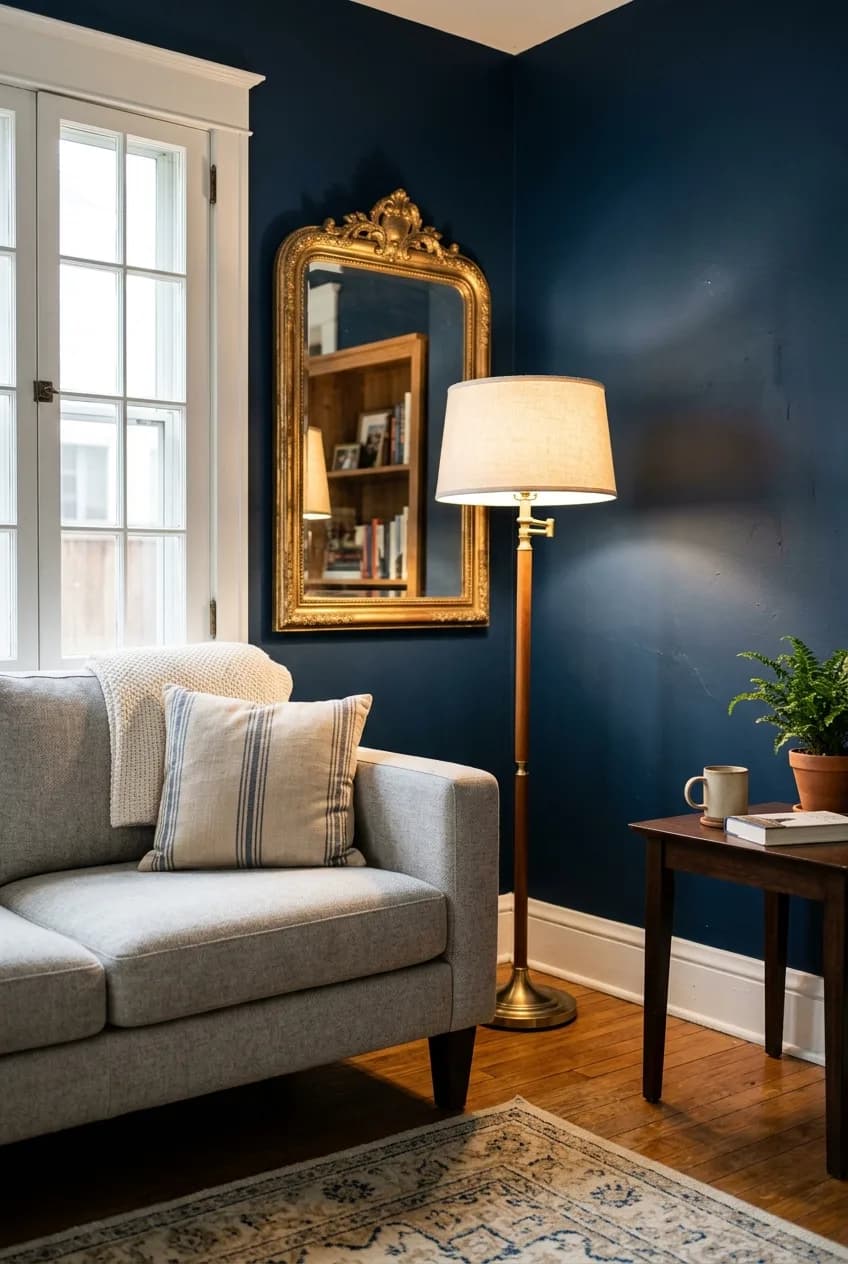
It sounds like a recipe for disaster, but sometimes the boldest choice is the right one. In certain situations, a dark, moody color can actually make a small room feel more expansive and infinitely more interesting.
How does this work? Dark colors recede. In a small space, a deep navy, charcoal gray, or forest green can blur the room's corners and edges, creating an illusion of depth. Instead of seeing the four distinct walls, your eye perceives a continuous, undefined space that feels mysterious and sophisticated. This strategy is especially effective in rooms that don't get a ton of natural light to begin with, or in spaces used primarily in the evening, like a den or TV room. Why fight the darkness when you can embrace it?
The secret to pulling this off is balance. You can't just paint the room black and call it a day. To avoid a cavernous feel, you need to introduce contrast and light. Pair dark walls with a lighter-colored sofa, a crisp white ceiling, or a neutral area rug. Use reflective surfaces strategically: a large mirror, metallic finishes on lamps and tables, or glass-fronted cabinets will bounce the available light around the room, adding sparkle and life.
Ultimately, a dark color embraces the inherent coziness of a small footprint. It creates a 'jewel-box' effect that feels luxurious, curated, and intentional in a way a generic light paint often can't. It's a choice that says you're designing with confidence.
Beyond Hue: How Sheen and Trim Transform a Room
The color you choose is only half the story. The paint's finish, or sheen, has a huge impact on how that color looks and how it interacts with light. The same is true for your trim—how you treat it can either expand or constrict your space.
Choosing the Right Paint Sheen
Paint sheen refers to the level of gloss in the paint, which determines how much light it reflects. For small rooms, the most common choices are matte, eggshell, and satin.
Sheen | Light Reflection | Pros & Cons for a Small Room |
|---|---|---|
Matte / Flat | Very low reflection | Pro: Excellent at hiding imperfections on older walls. Creates a soft, velvety look. Con: Least durable and hardest to clean. |
Eggshell | Low reflection with a soft glow | Pro: The most popular choice. Balances durability with a low-sheen finish. Hides flaws better than satin. Con: Can still be tough to scrub. |
Satin | Medium reflection, noticeable sheen | Pro: Very durable and easy to clean. The sheen can help bounce light. Con: Highlights every bump, crack, and roller mark on the wall. |
Here's a crucial insight: if your walls have a lot of imperfections (common in older homes), which are more noticeable in a confined space, a matte or flat finish is your best friend. It will absorb light and conceal those flaws beautifully. Conversely, if you've chosen a dark, dramatic color, a satin finish can be a strategic ally, as its gentle sheen will help reflect the limited light in the room and prevent the color from feeling too flat and heavy.
What to Do With Your Trim
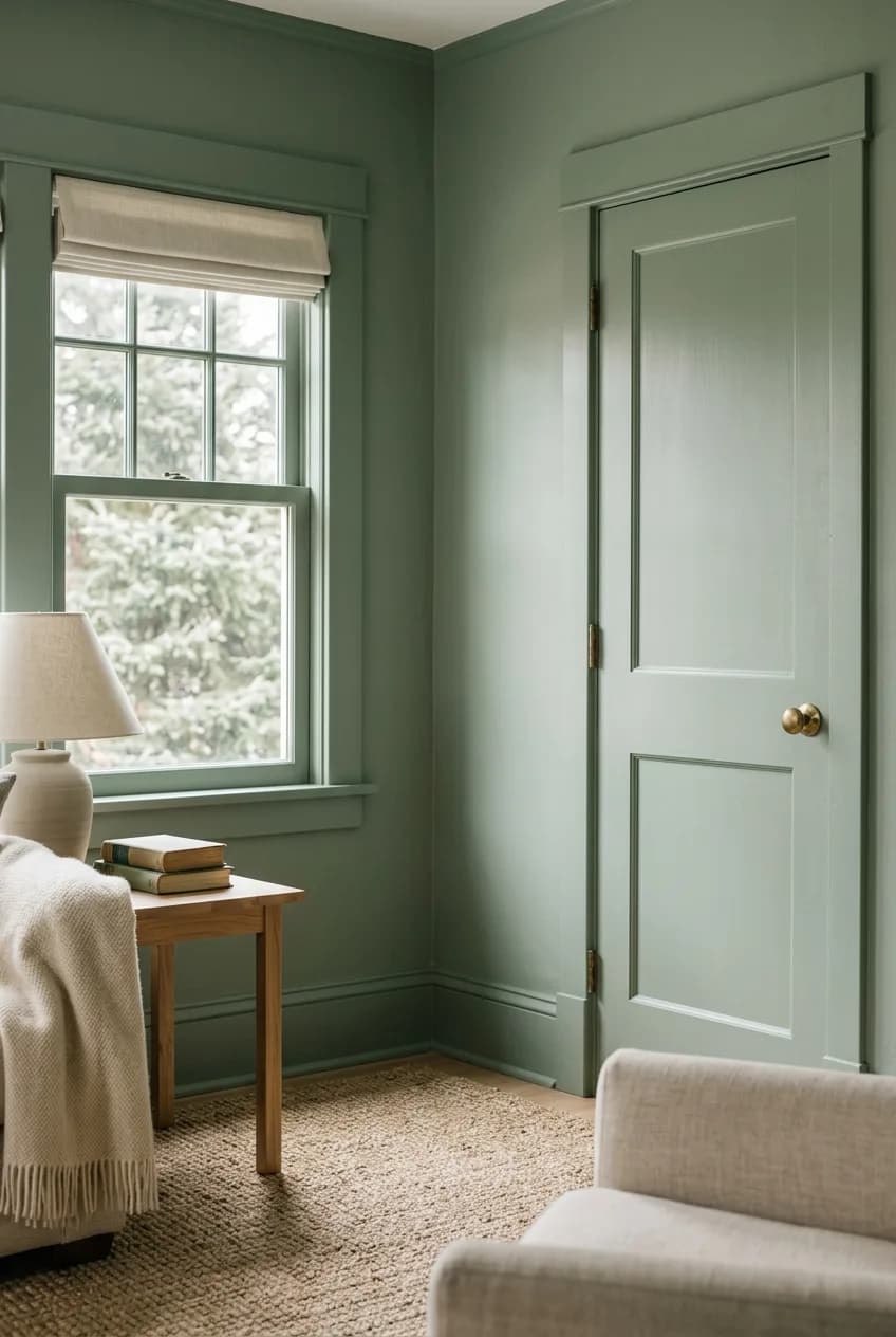
The default is often to paint trim a crisp, semi-gloss white. While this can look sharp, in a small room, that high contrast can create a 'grid' effect, outlining the room's small dimensions and making it feel more boxed-in. You have better options.
- Matching Trim: Painting the trim the same color as the walls is a modern, sophisticated move. It blurs the lines between wall and trim, making the walls appear taller and the space more seamless.
- Color Drenching: This takes it a step further. Walls, trim, doors, window frames, and even radiators are all painted the same color. This creates a deeply cohesive and immersive look that makes a room feel intentionally designed and surprisingly spacious.
- Subtle Contrast: If you want some contrast, try painting the trim just one or two shades lighter or darker than the wall color from the same paint strip. This creates definition without the jarring effect of bright white.
The Final Verdict: How to Test Paint Colors Like a Pro
You've considered your light, you've debated light vs. dark, and you've picked a sheen. Now comes the most important step of all: testing. Please, never, ever choose a final color based on that tiny paper chip under the harsh fluorescent lights of the hardware store. It's the #1 mistake people make, and it almost never ends well.
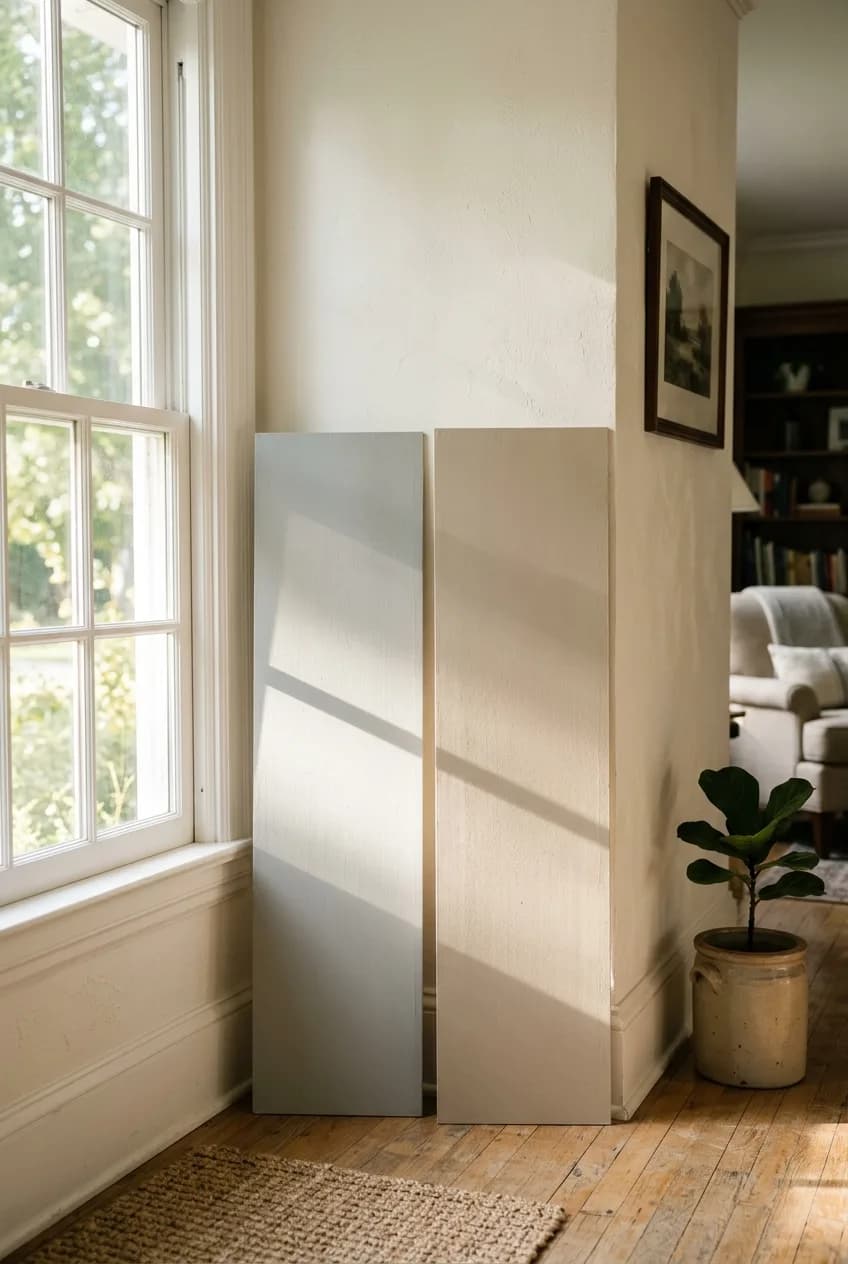
The only way to know for sure is to see the color in your actual room, with your actual light and your actual furniture. The best practice is to get a sample pot and paint a large poster board or foam core board (at least 12x12 inches). This is far better than painting a splotch directly on your wall, as the existing wall color will influence how you perceive the new one. You can also order peel-and-stick samples from companies like Samplize, which are incredibly convenient.
Once you have your large samples, don't just stick them on one wall. Move them around! Place one near a window and another on the darkest wall. Most importantly, live with them for a day or two. Observe how the color shifts in the bright morning light, the warm afternoon sun, and at night with your lamps on. A color you love at 10 AM might look completely different at 8 PM.
And here’s a final pro tip: Always test your paint samples vertically against the wall, not lying flat on a table or the floor. Light hits a vertical surface completely differently, and the way the color reflects back to your eye will change dramatically. This simple step ensures what you see is what you’ll actually get.